Following are visualizations of data. Many are interactive and created using Tableau Public. In some cases I’ve recorded myself using the visualization to tell a story, and all you have to do is watch.
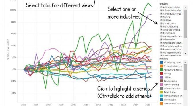
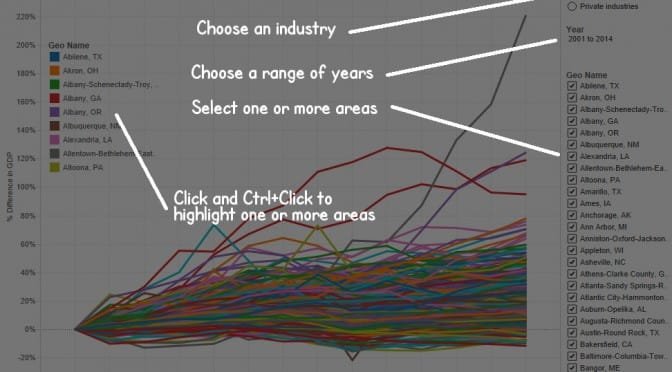
An interactive visualization of a new data series from the Bureau of Economic Analysis.
The Bureau of Economic Analysis is an agency of the United States Department of Commerce. BEA describes its role as “Along with the Census Bureau, BEA is part of the Department’s Economics and Statistics Administration. BEA produces economic accounts statistics that enable government and business decision-makers, researchers, and the American public to follow and understand the performance of the Nation’s economy. To do this, BEA collects source data, conducts research and analysis, develops and implements estimation methodologies, and disseminates statistics to the public.”
This week BEA issued a release of a new series of data: gross domestic product (GDP) by state for 21 industry sectors on a quarterly basis. BEA defines GDP as “the value of the goods and services produced by the nation’s economy less the value of the goods and services used up in production.” It is the value of the final goods and services produced.
In describing this data, BEA says “These new data provide timely information on how specific industries contribute to accelerations, decelerations, and turning points in economic growth at the state level, including key information about the impact of differences in industry composition across states.” This data series starts in 2005. The announcement of the release of this data from BEA is here.
I’ve gathered the data for this series for all states and present it in an interactive visualization using Tableau Public. I present the series in real dollars, meaning that BEA adjusted the numbers to account for changes in the price level, or inflation.
In the visualization you may use several different presentations of the data and filter for specific states or industries. The series are presented as percentage change over time since the first values, so that growth, rather than magnitude, of GDP is shown.
Kansas State Department of Education makes available tables of the number of employees working in Kansas schools. Employees are classified in two broad categories, Certified and Non-Certified. Within each category, employees are further classified by job type such as Superintendent, Curriculum Specialist, and Social Worker.
Visualization of certified employees, showing Principals and Curriculum Specialists highlighted.I’ve gathered the tables back to fiscal year 2002 (the 2001 – 2002 school year) and present them in an interactive visualization. There are separate visualizations for Certified and Non-Certified employees. In each, as shown in the instruction, you may check the check boxes to add or remove types of employees. For the employee types that are shown, you may click to highlight types apart from the others.
The line charts show the relative change in the number of employees. You may learn whether the number of employee type A is growing faster or slower than employee type B.
The visualization also holds tables showing the number of employees.
Click here to open the visualization in a new window.
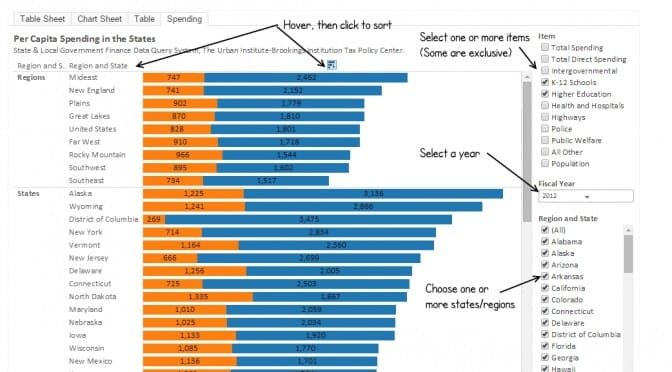
An interactive visualization holding per-capita spending in several categories for each state.
Tableau sort iconIn the visualization you may select one of more spending categories, select any combination of states and regions, select years, and view data as a table or chart. By hovering near column titles and clicking on a sort icon, you may sort in ascending or descending order.
Of note: Some of the spending categories should not be selected at the same time, as the stacked bar chart adds them. For example, you would not want to select anything else if “Total Spending” is selected, as the other items are already included in “Total Spending.” Similarly, you would not want to select “Population” along with any items that are money amounts.
Data is from State & Local Government Finance Data Query System. slfdqs.taxpolicycenter.org/pages.cfm. The Urban Institute-Brookings Institution Tax Policy Center. Data from U.S. Census Bureau, Annual Survey of State and Local Government Finances, Government Finances, Volume 4, and Census of Governments (2012). Date of Access: (07-Jan-2015). Visualization created using Tableau Public.
Reactions to the release of National Assessment of Educational Progress scores for Kansas and the nation. Also, an interactive visualization.
Results for the 2015 administration of the National Assessment of Educational Progress became available October 28. The test, sometimes called the “nation’s report card,” is described as “the largest nationally representative and continuing assessment of what America’s students know and can do in various subject areas.”
The Wichita Eagle didn’t have much to say on this, reporting “Results from the latest National Assessment of Educational Progress show that Kansas scores dropped in most areas since 2013, state education officials announced Wednesday. The decreases echo a downward trend in scores nationwide on the NAEP exam, also known as the Nation’s Report Card.”
The Kansas State Department of Education reported “Results from the 2015 National Assessment of Educational Progress (NAEP) exams, also known as the Nation’s Report Card, show that Kansas followed the national trend of decreasing scores. Across the nation this year, both fourth- and eighth-grade mathematic scores, as well as eighth-grade reading scores, are lower in 2015 than in 2013. Fourth-grade reading scores aren’t significantly different from 2013.”
The Lawrence Journal-Worldused the Associated Press story: “Kansas schoolchildren are faring worse on a test known as the nation’s report card. The state’s performance dip follows a national trend of falling scores on the National Assessment of Educational progress.” So too did the Topeka Capital-Journal.
The Kansas Association of School Boards noted “State and national education leaders, including KASB, are currently researching the latest National Assessment of Educational Progress scores, which were released earlier this week. Both nationally and in Kansas the 2015 NAEP results decreased slightly. … While Kansas results decreased slightly, Kansas student achievement remained above the national average in 4th- and 8th grade math and 8th grade reading and was the same as the national average in 4th grade reading. KASB is currently doing an in-depth analysis of the NAEP results and release its findings as soon as possible.”
Kansas Governor Sam Brownback issued a statement: “Today’s NAEP scores reflect the need for real education reform to benefit our students. This is a complex issue with no single cause or solution and today’s results confirm a trend showing that even though education funding has increased by more than $1 billion over the past decade, NAEP scores have remained largely flat. … While our Kansas schools remain above the national average, we can and should do more. We want our students to excel and have the skills they need to succeed in school and life in the 21st century. To do that, we must work to get more dollars into the classroom and into the infrastructure our teachers need to improve student performance, particularly in math. We need flexibility at the local level to address students’ needs, and we should support the great efforts of the thousands of teachers who work every day to help give our students opportunity for a brighter future.”
Some of these statements compared Kansas scores to the national average. That is not appropriate if there are subgroups that score at different levels, and if the composition of these subgroups varies significantly between states or the national average. That is the case with Kansas, which has significantly lower minority populations than the nation and some states. Care must be used when making comparisons.
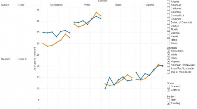
To assist in understanding NAEP scores, I’ve updated two interactive visualizations with 2015 data. One visualization shows subgroups based on race/ethnicity, and the other shows subgroups based on national school lunch program eligibility, which is a commonly-used surrogate for income.
Each visualization has a number of tabs that display data in different ways. Most tabs allow for filtering of data in several ways.
Here is an interactive version of the list of delinquent property taxes in Sedgwick County. This list is printed in a local newspaper three times each summer.
The Sedgwick County Treasurer issues a disclaimer regarding this list, which is that some of the taxes may have been paid, or are waiting the result of a grievance or protest.
Click here to open the interactive list in a new window. As shown in the illustration below, you may click to expand the addresses of properties for an owner, and sort by any column.
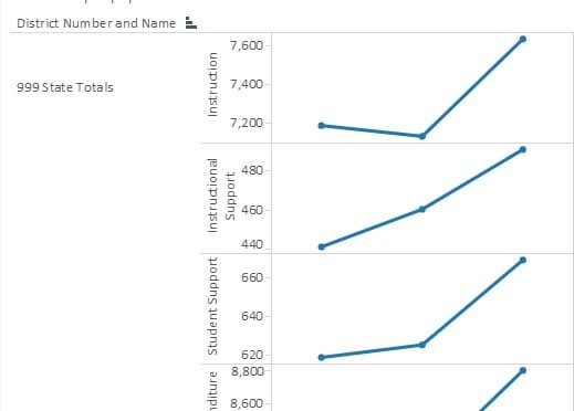
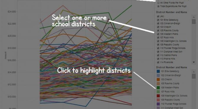
An interactive visualization of data provided to members of the Kansas 2015 Special Committee on K-12 Student Success.
The Kansas 2015 Special Committee on K-12 Student Success held its first meeting on October 23. As part of the meeting, data on school spending was made available. Of particular interest may be the data on instruction spending.
Dale M. Dennis, Deputy Commissioner of Education, provided committee members these definitions of instruction spending categories:
Instruction — Includes the activities dealing directly with the interaction between teachers and students. This catgory [sic] includes only regular and part-time teachers, teacher aides or assistants, homebound teachers, hospital-based teachers, substitute teachers, and teachers on sabbatical leave.
Student Support Services — Includes the following services: attendance and social work, guidance, health, psychological, speech pathology and audiology.
Instructional Support Services — Includes the following services: improvement of instruction, library and media, instruction-related technology, and academic student assessment.
Example table from visualization.Committee members were supplied with spreadsheets holding one year’s spending. I’ve gathered the spreadsheets for the three years that were provided and present them in one interactive visualization. One view of the data shows the data items for each school district, with the three years shown together. I added amount per pupil calculations.
Example from visualization.A second view shows the per-pupil values as a line graph over the three years.
This spending data represents Kansas state support only and does not include spending from federal or local funding sources. The provided data was not adjusted for inflation.
Click here to open the visualization in a new window. Visualization created using Tableau Public.
An interactive visualization of gross domestic product for metropolitan areas.
Gross domestic product is the sum of the value of all goods and services produced for a period of time. The Bureau of Economic Analysis makes this statistic available for metropolitan areas. GDP is not the only way to measure the economic health of a region, but it is one way. I’ve gathered the data and made it available in an interactive visualization.
Growth of GDP for Wichita and selected cities. Click for larger version.When using the visualization you may select total GDP, or GDP for private industry or government alone. You may select any number of metropolitan areas to appear on the chart. By clicking metro names in the legend, you can highlight or emphasize the series for one metro area. Use Ctrl+click to select more than one at a time.
Of note, recently James Chung delivered a lecture in Wichita. As part of the presentation, he mentioned three areas that he thought were doing things well: Cedar Rapids, Des Moines, and Omaha. A nearby illustration shows the visualization of the growth of GDP for these metro areas and Wichita. You can see that GDP for these areas have grown faster than has GDP for Wichita. (This visualization shows GDP change since the start of the chart, so that the growth of metro areas of different sizes can be compared.)
Growth of GDP for Wichita and selected cities. Click for larger version.Another illustration compares Wichita to several cities that were part of the Wichita Metro Chamber of Commerce’s city-to-city visits. While in some years the visit has been to cities like Austin that have grown rapidly, that is not always the case.
Click here to open the visualization in a new window.
There is an update with data for a new year; click here.
Kansas school fund balances rose slightly this year, both in absolute dollars and dollars per pupil.
As Kansans debate school funding, as the Kansas Supreme Court considers ordering more school spending, and as school spending boosters insisting that school spending has been slashed, a fact remains constant: Kansas schools don’t spend all the money they’ve been given. Fund balances have been growing almost every year, including this year.
Fund balances are necessary for cash flow management. The issue is what levels of balances are necessary. Based on recent data from the Kansas State Department of Education, fund balances rose rapidly after 2008, and have remained largely level since 2011.
I’ve gathered data about unspent Kansas school funds and presented it as an interactive visualization. You may explore the data yourself by using the visualization. Click here to open the visualization in a new window. Data is from Kansas State Department of Education. Visualization created using Tableau Public.
Example from Kansas school fund balances visualization.