Click here to use this interactive visualization. Source is Kansas Fiscal Facts.

Following are visualizations of data. Many are interactive and created using Tableau Public. In some cases I’ve recorded myself using the visualization to tell a story, and all you have to do is watch.
Click here to use this interactive visualization. Source is Kansas Fiscal Facts.
Following is data regarding departures from the Wichita airport for 2013. Of note is the decline of flights to Atlanta. Data is from Bureau of Transportation Statistics. Use the visualization below, or click here to open it in a new window, which may work best.

Why do Kansans pay taxes, including sales tax on food, to fund millions in subsidy to a company that is experiencing a sustained streak of record profits?
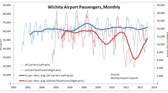
As the Wichita City Council prepares to authorize funding for Southwest Airlines, it’s worth taking a look at updated statistics regarding the airport. The agenda item the council will consider is available here.

Of note is that while the Southwest passenger count is rising, it started from a low position. Also, the count has not risen to the level that AirTran experienced in the middle of the last decade and as recently as 2011.


The number of flights is an important statistic. Greater attention is given to fares, but for many travelers, especially business travelers, an available flight at any price is paramount. Last year at this time I wrote “A program designed to bring low air fares to Wichita appears to meet that goal, but the unintended and inevitable consequences of the program are not being recognized. In particular, the number of flights available at the Wichita airport continues to decline.” So it is good news that the number of flights has risen.

Load factor — the percent of available seats that were sold — is rising in Wichita, as it is nationally.
The last set of four charts is from an interactive visualization I prepared using data from the Bureau of Transportation Statistics. Click here to open the visualization in a new window. You may select any number of airports for display on the charts.
Recently Southwest reported record high profits for the quarter ending in June. The company said that net income was $485 million, which it said represented the fifth consecutive quarter of record profits.
We might ask this question: Why do Kansans across the state pay taxes, including sales tax on food, to fund millions in subsidy to a company that is experiencing a sustained streak of record profits?
Let’s ask critics of current Kansas economic policy if they’re satisfied with the Kansas of recent decades.
Critics of Kansas Governor Sam Brownback and his economic policies have pounced on slow job growth in Kansas as compared to other states.

At the end of this period, Kansas is just about in the middle of the states. But notice that early in this period, the line for Kansas is noticeably nearer the top than the bottom. As time goes on, however, more states move above Kansas in private sector job creation.

Some Kansas newspaper editorialists and candidates for office advocate for a return to the policies of Graves/Sebelius/Parkinson. Let’s ask them these questions: First, are you aware of the poor record of Kansas? Second, do you want to return to job growth like this?

Spending by Kansas state and local governments has grown faster than in most other states.

Data is from State & Local Government Finance Data Query System. http://slfdqs.taxpolicycenter.org/pages.cfm. The Urban Institute-Brookings Institution Tax Policy Center. Data from U.S. Census Bureau, Annual Survey of State and Local Government Finances, Government Finances, Volume 4, and Census of Governments (1977-2011). Date of Access: (29-Jul-2013).
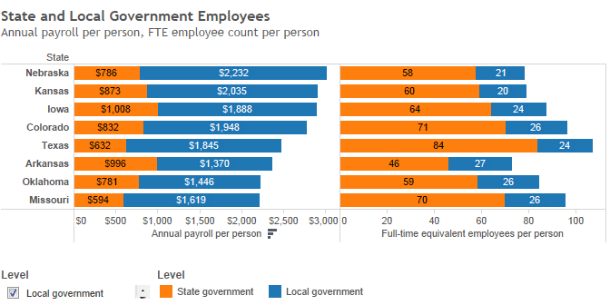
The states vary widely in levels of state government and local government employees and payroll costs, calculated on a per-person basis. Kansas ranks high in these costs, nationally and among nearby states.
Two states have annual payroll costs of over $4,000, calculated by taking the total payroll cost and dividing by population. Many states operate on little more than half that. Only ten states have total government employee payroll costs greater than Kansas, on a per-person basis. (This does not include federal government employees.)
When looking at a selection of nearby states, we see that only Nebraska has higher payroll costs for state and local government employees, when calculated on a per-person basis using the state’s population.
This data is from the U.S. Census Bureau for 2012, the most recent year available. Using Tableau Public, I created an interactive visualization. I show the full-time equivalent employees divided by the population for each state. Also, the annual payroll divided by population. (The Census Bureau supplies payroll data for only one month, the month of March, so I multiply by 12 to produce an approximation of annual payroll cost.)

By clicking on column headers or footers (“State,” “Annual payroll per person,” Full-time equivalent employees per person”) you can sort by these values.
Click here to open the visualization in a new window. Data is from United States Census Bureau, Government Employment & Payroll, released March 2014.
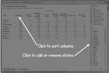
Kansas state government collects more tax revenue than most surrounding states. Additionally, severance taxes are a minor contribution to collections, even in Texas.
Note: this visualization has been updated. Click here for the most recent version.
The United States Census Bureau conducts an Annual Survey of State Government Tax Collections. It’s useful to gather figures for Kansas and some nearby states.
The data considers only tax collections by state government. It does not include cities, counties, school districts, or the many other taxing jurisdictions that states may have formed. I have computed this data on a per-person basis. Data is for 2013.

In some cases, state tax collections are substantially lower. Texas collects $1,955 per person per year, which is 25.75 percent less than Kansas.

I’ve created an interactive visualization of this data that you may use. Click here to open the visualization in a new window.

The performance of Kansas in entrepreneurial activity is not high, compared to other states.
The Ewing Marion Kauffman Foundation prepares the Kauffman Index of Entrepreneurial Activity. According to the Foundation, “The Kauffman Index of Entrepreneurial Activity is a leading indicator of new business creation in the United States. Capturing new business owners in their first month of significant business activity, this measure provides the earliest documentation of new business development across the country.”

I’ve prepared two visualizations that present this data. One holds data for all states. Click here to open it in a new window.

Visualization created using Tableau Public.

Despite its problematic nature, per capita income in Wichita is used as a benchmark for the economy. It’s not moving in the right direction. As Wichita plans its future, leaders need to recognize and understand its recent history.
One of the benchmarks used by Visioneering Wichita to measure the growth of the Wichita-area economy may not be the best statistic, and its interpretation requires caution.
The measure is per-capita personal income. Specifically, the benchmark goal of Visioneering is “Stop the 21-year decline of Wichita per capita income as a percentage of U.S. per capita income before 2011. By 2024 exceed the annual average of Omaha, Tulsa, Kansas City and Oklahoma City.” (Note that per capita measurements are problematic. See the section at the end of this article.)

One of the Visioneering concepts is the idea of peers. The cities Visioneering Wichita selected as Wichita peers are Omaha, Tulsa, Kansas City, and Oklahoma City. It’s useful to compare Wichita with these cities, and also with a few others that are comparable to Wichita and interesting for other reasons.


The current stance of Wichita civic leaders is that we need a plan to create jobs. But we’ve had plans, with Visioneering being just one.
These leaders also tell us that Wichita can’t compete with other cities in economic development because Wichita’s budget is too small. But as I show here, when Wichita leaders complain about a small budget for incentives, these officials don’t include all incentives that are available and regularly used. Not nearly all.
Per capita measures are problematic. They are not meaningless, but interpretation requires caution. Some of the issues with per capita measures are explained by Dave Trabert of Kansas Policy Institute:
Per-capita income is a bad measurement because it rewards cities that are losing people due to domestic migration and punishes those who are gaining.
Even without the per-capita issue, personal income is not a clean measure. Personal income can increase because federal transfer payments grew, employers had to spend more to provide health care benefits, and other items that have nothing to do with measuring relative economic growth.
Better measurements would be private sector jobs, private sector GDP and private sector wage and salary disbursements. Unless the point of Visioneering is to grow government, the measurements should only be of private sector elements.
KPI has explained how the mathematics of per-capita measures can produce results that seem paradoxical. A recent edition of Rich States, Poor States has a section devoted to these problems. Here’s an explanation of a scenario that requires caution to interpret:
Further, the residents of a state can be better off even if that state’s per-capita or median income decreases. If, for example, 50,000 low income agriculture workers move into Texas, those workers’ incomes almost surely rise (or else they would not have moved there). The residents and business owners in Texas who benefit from their labor services are better off, and the final result is that no one is worse off. But the per-capita income in Texas may actually go down if the low income agricultural workers earn less than the state’s average wage.