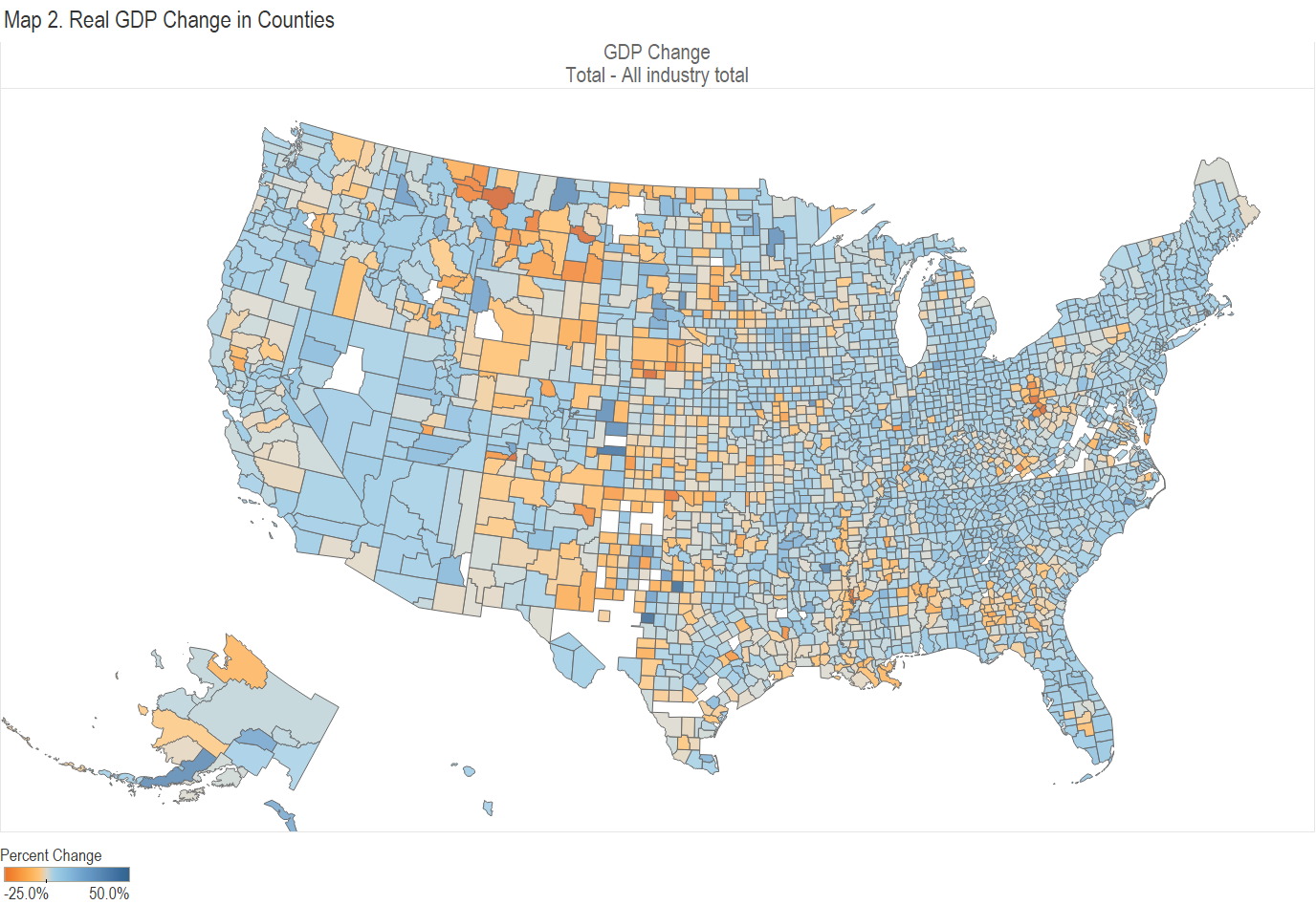
A visualization of real gross domestic product in counties by industry.
This interactive visualization presents annual gross domestic product (GDP) by county and industry. The source of the original data is Bureau of Economic Analysis, an agency of the United States Department of Commerce. I’ve gathered this data, performed some calculations, and present it in an interactive visualization.
BEA provides this definition: “Gross domestic product (GDP) by county is the value of goods and services produced by the county’s economy less the value of goods and services used up in production. GDP by county is the substate counterpart of the nation’s GDP, the Bureau’s featured and most comprehensive measure of U.S. economic activity.” (1)https://www.bea.gov/news/2021/gross-domestic-product-county-2020. BEA provides these values as real, meaning adjusted for inflation. Data ranges from 2001 to 2021. I also incorporate BEA’s county population estimates to produce per capita values.
There are some counties in which per capita GDP values are extraordinary. The most extreme is Loving County, Texas. It is the least-populated county in the nation with estimated population of 169 in 2020. But it has many oil wells. For the industry “Mining, quarrying, and oil and gas extraction,” the difference in per capita GDP from the nation is $52,519,746, a factor of 938. Most of these extreme examples are sparsely-populated counties with large energy production. Since their scale is difficult to work with, I have eliminated counties with values larger than $200,000 in 2020.
BEA classifies counties into three size groups with their counts:
- Large counties (141 counties with populations greater than 500,000 in 2020)
- Medium counties (467 counties with populations between 100,000 and 500,000 in 2020)
- Small counties (2,504 counties with populations less than 100,000 in 2020)
Table 2 of the visualization presents the county difference for an industry. It ranks the counties within the size group(s) selected.
Table 3 presents the differences for one or more counties by industry.
The news release for this data is Gross Domestic Product by County, 2021.
You can access the interactive visualization and create your own charts here: Visualization: Real Gross Domestic Product by County and Industry.
For more visualizations, click here.
Click on images for larger versions.


References