Tag: Economics
-
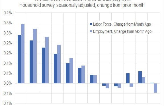
Wichita jobs and employment, April 2019
For the Wichita metropolitan area in April 2019, the labor force is up, the number of unemployed persons is down, the unemployment rate is down, and the number of people working is up when compared to the same month one year ago. Seasonal data shows small declines in labor force and jobs from March.
-
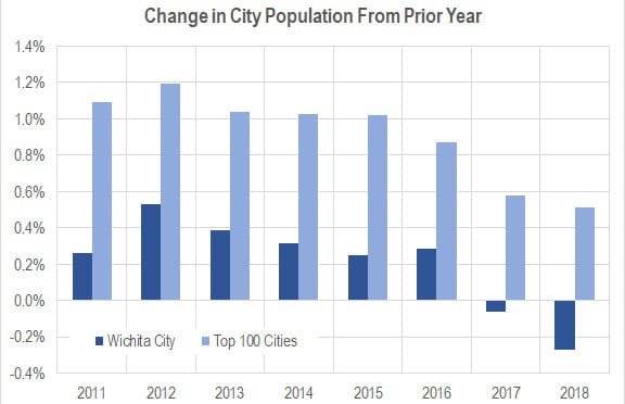
Wichita population, 2018
The City of Wichita lost 1,052 in population from 2017 to 2018, a decline of 0.27 percent.
-

Sedgwick County job growth continues strong pace
In the fourth quarter of 2018, Sedgwick County continued strong job growth.
-

Kansas jobs, April 2019
Employment in Kansas continues to grow in April 2019, but continues a trend of slower growth than the nation. The labor force is smaller.
-
Wichita personal income growing, but slowly
Among the nation’s 383 metropolitan areas, Wichita ranked 347th for personal income growth.
-

Kansas personal income growing, but slowly
For 2017, just four states had less growth in personal income than Kansas.
-

The finances of Intrust Bank Arena in Wichita
A truthful accounting of the finances of Intrust Bank Arena in downtown Wichita shows a large loss. Despite hosting the NCAA basketball tournament, the arena’s “net income” fell.
-

More Wichita planning on tap
We should be wary of government planning in general. But when those who have been managing and planning the foundering Wichita-area economy want to step up their management of resources, we risk compounding our problems.
-

Updated: Gross domestic product by state and industry
An interactive visualization of GDP by state and industry, updated with annual data through 2018.
-
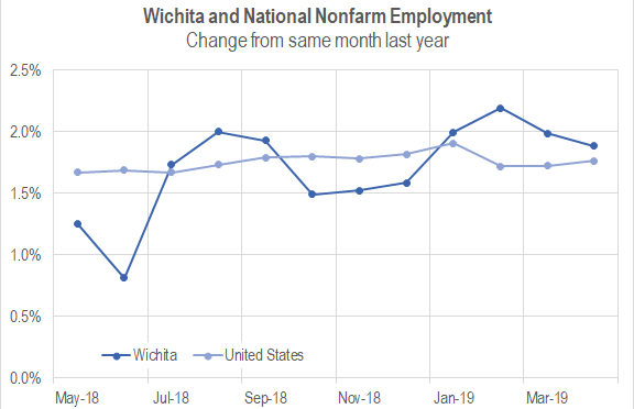
State of the City, Wichita: Employment strength
Wichita Mayor Jeff Longwell’s State of the City video relies on flimsy evidence and plucks scant good news from a sea of bad. This is a problem.
-
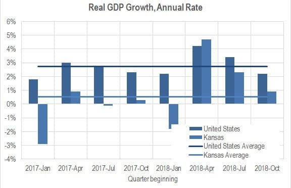
Kansas GDP
In the fourth quarter of 2018, the Kansas economy grew at the annual rate of 0.9 percent, down from 1.2 percent the previous quarter.
-
Wichita jobs and employment, March 2019
For the Wichita metropolitan area in March 2019, jobs are up, the labor force is up, and the unemployment rate is unchanged when compared to the same month one year ago. Seasonal data shows a small decline in jobs from February.