Following are visualizations of data. Many are interactive and created using Tableau Public. In some cases I’ve recorded myself using the visualization to tell a story, and all you have to do is watch.
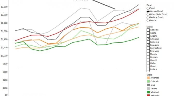
An interactive visualization of per-capita spending in the states, by fund.
Is your state a big spender? Or is it frugal with your tax money? To see how your state compares with others in spending, use the interactive visualization below. The figures presented are per-person, and not adjusted for inflation.
The example appearing below shows general fund spending for Kansas and some surrounding states.
In the article, David Dorsey writes: “A widely-shared solution to improving student outcomes is to put more money in the classroom. What does it say about the importance of student achievement to local school boards and administrations when pay increases are disproportionately higher to those who are not in the classroom?”
And later: “Much has been documented about teacher shortages, especially due to those leaving after only a few years in the profession. One way to reverse that trend would be for districts to make spending choices that would support the commitment to keeping quality teachers.”
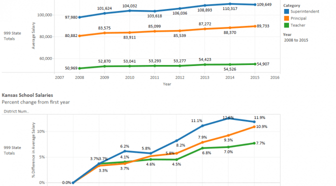
Statewide, since 2009, KSDE data shows these cumulative salary increases:
It’s also useful to look at individual districts. For example, for the Wichita public school district, there are these cumulative salary increases since 2009:
The Wichita district has just one superintendent, so no matter how much the salary rises, it’s still the salary for just a single person and has a negligible effect on total district payroll costs. There are, however, 89 principals, so the increase for this category of employee matters much more.
But you have to wonder: What about the teachers?
I’ve gathered the data and present it in an interactive visualization. You may select any single district, or use district 999 for statewide totals. Click here to open the visualization in a new window. Data is from Kansas State Department of Education. Figures include fringe benefits. Visualization created using Tableau Public. There are several missing values which can make the percentage increase invalid for a single year.
Kansas school salaries and change, statewide, through 2015. Click for larger version.
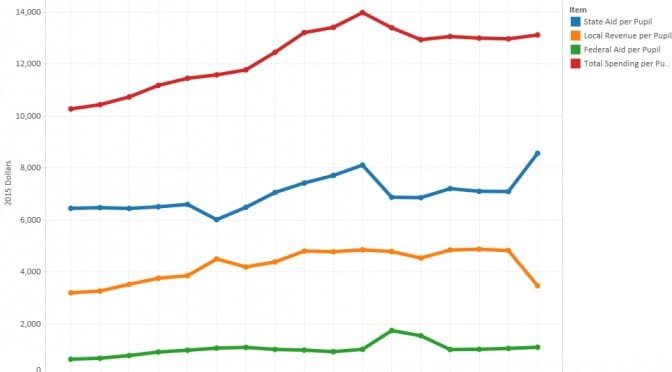
The accompanying visualization holds both nominal dollar amounts and amounts adjusted to reflect 2015 dollars. Data includes state aid, local aid, federal aid, and total spending for each school district, both total and per pupil. The visualization includes both tables and charts.
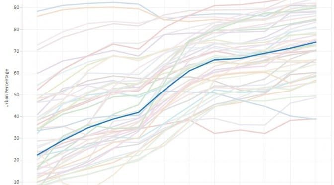
How does the population in Kansas compare to the nation and other states?
One of the most-often repeated themes in Kansas is that we are a rural state. Therefore, comparisons of Kansas to other states must be tempered and adjusted by this. It seems to be common knowledge.
Rural populations of the states. Click for larger version.There may be several ways to measure the “ruralness” of a state. One way is the percent of the state’s people that live in rural areas. The U.S. Census Bureau has these statistics. In the chart made from these statistics, Kansas is right in the middle of the states. 25.80 percent of Kansans live in rural areas.
That’s not too far from the country as a whole. For the entire United States, 80.7 percent of the population lives in an urban setting, according to the 2010 census. For Kansas, the figure is 74.2 percent.
Over time, Kansas is becoming more of an urban state, just as are most states and the country as a whole.
Do these numbers mean anything? It’s common for Kansas politicians to emphasize — even exaggerate — whatever connections they may have to a family farm. It’s part of a nostalgic and romanticized view of Kansas, the Kansas of Home on the Range. We are the “Wheat State” and “Breadbasket of the World,” and “One Kansas farmer feeds 128 people (plus you).”
So while Kansas is in the middle in the ranking of percent of population living in rural areas, our state’s politicians continue to play the “rural card.”
Voters and policymakers should keep this in mind, although politicians may not.
Click here to view and use an interactive visualization of states and urban population.
Percent urban population by state, with Kansas emphasized. Click for larger.
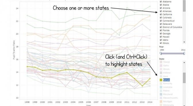
Kansas ranks near the top of the states in having a low pupil-teacher ratio.
Pupil-Teacher Ratios in the States. Click for larger version.Data from National Center for Education Statistics, ELSI Elementary and Secondary Information System, shows that Kansas is near the top of the states in pupil-teacher ratio, meaning that Kansas has many teachers compared to the number of students.
A common complaint in Kansas is that class sizes have been rising. While pupil-teacher ratio is not the same measure as class size, the question is this: If Kansas has a low pupil-teacher ratio, but class sizes are large and rising, what are these teachers doing?
In the chart of pupil-teacher ratios over time, we see that while the ratio in Kansas rose during the 2014 school year, the trend over time is down, meaning that the number of teachers has increased faster than enrollment. Also, note the position of Kansas compared to other states. The pupil-teacher ratio in Kansas is lower than in most states.
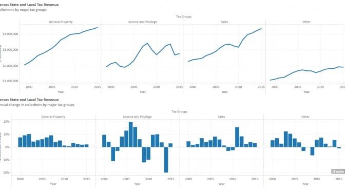
Tax group definitions.In order to simplify this chart, I created four groups of taxes. As there are many taxes that are small in amount, I group them together as “Other.” For the group “Sales” I include the general sales and use tax, plus the cigarette and tobacco tax, plus liquor and beer tax, as these are of the same nature as the general sales tax.
Note this is both taxes collected by the state, and also by local governments.
Source of data is Kansas Tax Facts, various years. Values are nominal; not adjusted for inflation. To access the interactive visualization that is the basis of the example shown below, click here.
Kansas State and Local Tax Revenue. Click for larger.
Kansas school employment declined for the current school year, and ratios of employees to pupils rose.
Figures released by the Kansas State Department of Education show the number of teachers and certified employees declined for the 2015-2016 school year.
The number of Pre K through grade 12 teachers fell to 30,413 from 30,868, a decline of 1.48 percent. Certified employees fell to 41,405 from 41,975, or by 1.36 percent.
Enrollment fell too, from 464,395 to 463,504, or 0.19 percent. As a result, the ratios of teachers to students and certified employees to students rose. The pupil-teacher ratio rose from 15.04 pupils per teacher to 15.24. For a school with 1,000 students, this change would be caused by the loss of one teacher.
The relative change in enrollment and employment is not the same in every district. The Kansas City school district saw its pupil-teacher ratio continue to decline, although the certified employee-pupil ratio rose slightly.
Of note, Kansas school fund balances rose slightly this year, both in absolute dollars and dollars per pupil.
I’ve gathered the numbers from KSDE and present them in an interactive visualization. Click here to access it.
Kansas School Employment State Totals. Click for larger.
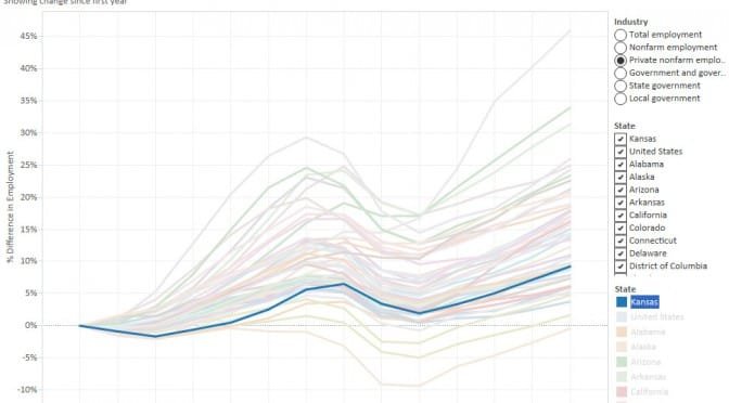
An interactive visualization of employment in the states.
I’ve gathered employment data from the Bureau of Economic Analysis is an agency of the United States Department of Commerce, for the states and present it in an interactive visualization using Tableau Public. In the visualization you may use several different presentations of the data and filter for specific industries. The series are presented as the percentage change since the first values, so that relative growth, rather than magnitude, of employment is shown.
Growth in private nonfarm employment, Kansas emphasized. Click for larger.The nearby example from the visualization shows growth in private nonfarm employment, with Kansas emphasized against the other states.
An interactive visualization of employment in metropolitan areas.
Growth in Employment by MSA. Wichita is the bottom line. Click for larger version.I’ve gathered employment data from the Bureau of Economic Analysis, an agency of the United States Department of Commerce, for all available metropolitan areas and present it in an interactive visualization using Tableau Public. In the visualization you may use several different presentations of the data and filter for specific areas and industries. The series are presented as the percentage change since the first values, so that relative growth, rather than magnitude, of employment is shown.
In the nearby example we can see that Wichita –- the bottom line — has performed poorly compared to some peers of interest.