Following are visualizations of data. Many are interactive and created using Tableau Public. In some cases I’ve recorded myself using the visualization to tell a story, and all you have to do is watch.
Following is a map of voting for the Wichita marijuana ballot issue, April 7, 2015. A vote of “Yes” was in favor of reducing the penalty for possession. View below, or click here to open in a new window or mobile device. Click or tap on a precinct to view data.
For a tabular presentation of this data and other Wichita election returns, click here. 37,166 votes were cast for the marijuana ballot measure, and 37,190 votes were cast for mayor.
Someone also asked if there was a correlation between the marijuana vote and the mayoral vote. A plot of the two is below. With R = .01, there is no correlation to speak of.
Following is a map of voting for the Wichita mayoral contest, April 7, 2015. View below, or click here to open in a new window or mobile device. Click or tap on a precinct to view data. For a tabular presentation of this data and other Wichita election returns, click here.
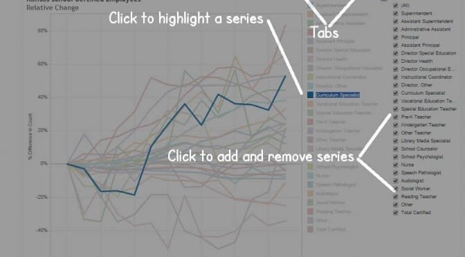
An interactive visualization of relative trends in Kansas school employment.
Kansas State Department of Education makes available tables of the number of employees working in Kansas schools. Employees are classified in two broad categories, Certified and Non-Certified. Within each category, employees are further classified by job type such as Superintendent, Curriculum Specialist, and Social Worker.
Visualization of certified employees, showing Principals and Curriculum Specialists highlighted.I’ve gathered the tables back to fiscal year 2002 (the 2001 – 2002 school year) and present them in an interactive visualization. There are separate visualizations for Certified and Non-Certified employees. In each, as shown in the instruction, you may check the check boxes to add or remove types of employees. For the employee types that are shown, you may click to highlight types apart from the others.
The line charts show the relative change in the number of employees. You may learn whether the number of employee type A is growing faster or slower than employee type B.
The visualization also holds tables showing the number of employees.
Click here to open the visualization in a new window.
Those who criticize lower Kansas tax rates tax rates as an experiment that may not work should be aware that we know with certainty what hasn’t worked in Kansas.
There are a number of ways to measure the performance of an economy. Often the growth of jobs is used. That’s fine. Here I present an alternative: the gross domestic product for a state. As with job growth, it is not the only measure of a state’s economy. GDP is a comprehensive measure, encompassing changes in population, employment, and productivity. The nearby static illustration from an interactive visualization shows Kansas (highlighted in blue) compared to some neighboring states.
Real GDP by state, Kansas highlighted, through 2013. Click for larger version.The top chart shows the change in GDP from the previous year. Kansas, highlighted in dark blue, is often near the bottom of a selection of neighboring states. The bottom chart shows growth in GDP since 1997. Again, Kansas is near the bottom of neighboring states.
Neither of these trends is recent. The Kansas economy has been underperforming for many years. We need no experiment to tell us this. It is in our data, and is part of the legacy of decades of moderate Kansas leadership.
The visualization holds data from the U.S. Bureau of Economic Analysis. You may click on a state’s name to highlight it. You may choose different industry sectors, such as government or private industry.
Click here to open the visualization in a new window. Visualization created using Tableau Public.
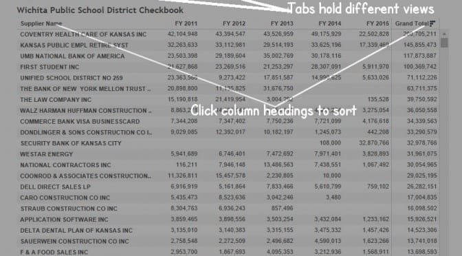
USD 259, the Wichita public school district, makes its monthly checkbook register available. I’ve gathered the monthly spreadsheets made the consolidated available for analysis through Tableau Public.
The workbook (click here to open it in a new window) has a number of tabs, each showing the same data organized and summarized in a different way.
There are some caveats. First, not all school district spending is in this database. For each year, the total of the checks is in the neighborhood of $350 million, while the total spending for USD 259 is over $600 million. So there’s spending that isn’t included in this checkbook data.
Second, there are suppliers such as “Commerce Bank Visa BusinessCard.” Payments made to this supplier are over $7 million per year. These payments from the district’s checkbook undoubtedly pay a credit card bill, and this alone doesn’t let us know what the $7 million was spent on.
There are some data quality issues, as seen nearby.
USD 259 supplies this advice with this data: “The information you find may cause you to ask more questions. If so, the person to contact is Wichita Public School’s Controller, Barbara Phillips. She can be reached at (316) 973-4628, or at bphillips@usd259.net.”
The performance of Kansas in entrepreneurial activity is not high, compared to other states.
The Ewing Marion Kauffman Foundation prepares the Kauffman Index of Entrepreneurial Activity. According to the Foundation, “The Kauffman Index of Entrepreneurial Activity is a leading indicator of new business creation in the United States. Capturing new business owners in their first month of significant business activity, this measure provides the earliest documentation of new business development across the country.”
Kauffman Index of Entrepreneurial Activity, showing Kansas highlighted against neighboring states. Click for larger version.As shown by the data, Kansas ranks low in entrepreneurial activity. This is true when Kansas is compared to the nation, and also when compared to a group of nearby states.
I’ve prepared two visualizations that present this data. One holds data for all states. Click here to open it in a new window.
Instructions for using the visualization of Kauffman data. Click for larger version.A second visualization presents the data for Kansas and some nearby states. Click here to open it in a new window.
What has been the trend in Kansas school employment and pupil-teacher ratio?
“More students, but fewer teachers — Since 2009, Kansas schools have gained more than 19,000 students but have 665 fewer teachers.” (Quality at Risk: Impact of Education Cuts, Kansas Center for Economic Growth)
This is typical of the sentiment in Kansas — that there are fewer teachers since Sam Brownback became governor, and that class sizes have exploded.
Here’s the data, fresh from Kansas State Department of Education. Can you show me where there has been a reduction in teachers, or a rise in the ratio of pupils to teachers? (Class size is not the same as pupil-teacher ratio. But if there are proportionally more teachers than students, we have to wonder why class sizes are growing — if, in fact, they are.)
The story is not the same in each school district. So I’ve created an interactive visualization that lets you examine the employment levels and ratios in Kansas school districts. Click here to open the visualization in a new window.
Kansas School Enrollment and EmploymentKansas School EmploymentKansas School Pupil-Teacher Ratio


 Data now available through November 2014.
 There are some data quality issues, as seen nearby.


