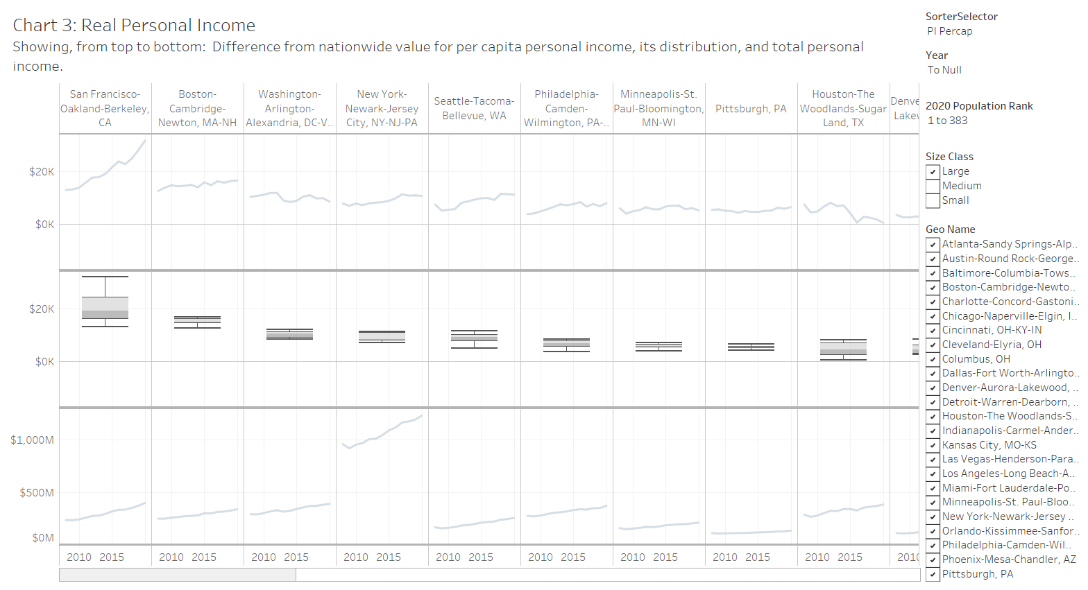
An interactive visualization of real personal income in metropolitan areas.
This interactive visualization presents annual real personal income by metropolitan statistical area (MSA). The source of the original data is Bureau of Economic Analysis, an agency of the United States Department of Commerce. I’ve gathered this data, performed some calculations, and present it in an interactive visualization.
BEA provides these values as real, meaning adjusted for inflation. These values are in 2012 dollars. Data ranges from 2008 to 2020.
Besides adjusting for the effects of overall inflation, BEA also adjusts these figures for regional price parity. This accounts for differences in prices in different regions of the nation.
BEA supplies this definition: “Personal income is the income received by, or on behalf of, all persons from all sources: from participation as laborers in production, from owning a home or unincorporated business, from the ownership of financial assets, and from government and business in the form of transfer receipts. It includes income from domestic sources as well as from the rest of the world. Personal income is the income that is available to persons for consumption expenditures, taxes, interest payments, transfer payments to governments and the rest of the world, or for saving.”
This interactive visualization holds real personal income and real per capita personal income for United States metropolitan areas.
One of the calculations I performed is determining the difference between the value for a metro and the nation. (Actually, the value for all the metropolitan statistical areas. In 2020, metro areas had population of 284 million, which is 86 percent of the national population of 329 million.) The most useful of these is the difference in per capita GDP between a metro and the nation. If this value is zero, the metro produces personal income at the same rate as the nation. This lets us place values in context: If a metro’s difference is negative, it is below the nation.
In 2020, real per capita personal income ranged from a high of $107,779 in Midland, TX to $31,779 in McAllen-Edinburg-Mission, TX. Among the 34 metros of over two million population, the highest was San Francisco at $77,876, with Riverside-San Bernardino-Ontario, CA lowest at $36,502.
In the visualization, chart 3 makes three presentations:
- The difference from national value for per capita real personal income for each metro
- The distribution of the difference from the national value
- Total personal income for each metro
For illustrating the distribution, I show a box plot, also known as a box-and-whisker plot. It helps illustrate the distribution of the data. The line in the box shows the median value. Half the values lie above the median and half below. It is not the same as the average (mean) value, although it is often close. The box covers the middle 50 percent of the data. The bottom of the box (sometimes called a hinge), therefore, indicates the twenty-fifth percentile, and the top, the seventh-fifth. The “whiskers” indicate — usually — a range that is 1.5 times the interquartile range. Values lying outside this range are typically considered outliers and may appear as dots.
In the visualization, controls allow for sorting the metros in several ways and selecting years.
Click here to access the visualization. For more visualizations, click here.
The news release from BEA for this release is here.
Click examples for larger versions.


