Tag: Economics
-

Kansas personal income
For the second quarter of 2019, the rate of personal income growth in Kansas was near the bottom of the states, although the rate was higher than the first quarter.
-
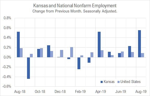
Kansas jobs, August 2019
Employment and the labor force rose in Kansas in August 2019 compared to the two previous months. Kansas employment continued a trend of lower growth than the nation over the year, but has been stronger in recent months.
-

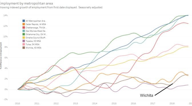
Wichita metro employment by industry
An interactive visualization of Wichita-area employment by industry.
-
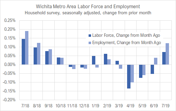
Wichita jobs and employment, July 2019
For the Wichita metropolitan area in July 2019, the labor force is up, the number of unemployed persons is down, the unemployment rate is down, and the number of people working is up when compared to the same month one year ago. Seasonal data shows small increases in labor force and jobs from June.
-
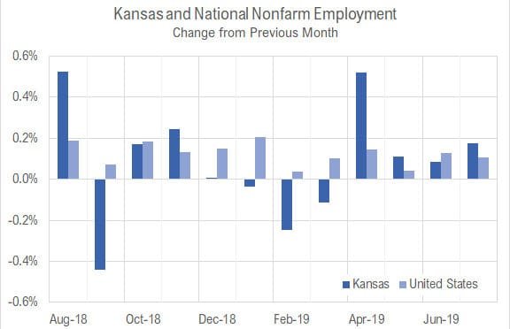
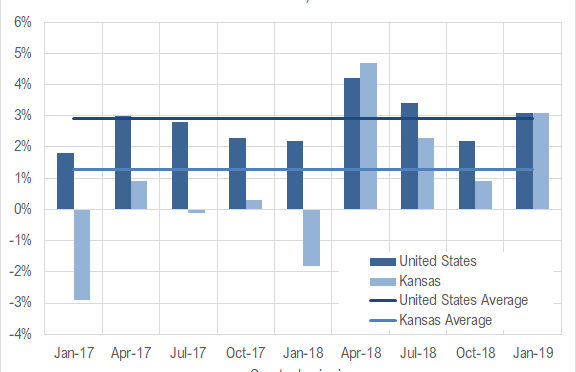
Kansas jobs, July 2019
Employment rose and the labor force in Kansas fell slightly in July 2019 compared to the two previous months, and employment continued a trend of lower growth than the nation over the year.
-

Kansas spending rising
Kansas spending is rising, and will probably rise at a faster pace.
-
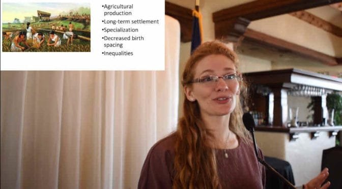
35,000 years of economic history in 35 minutes
Crystal Dozier, Ph.D., Assistant Professor, Department of Anthropology at Wichita State University, explains 35,000 years of economic history in 35 Minutes.
-
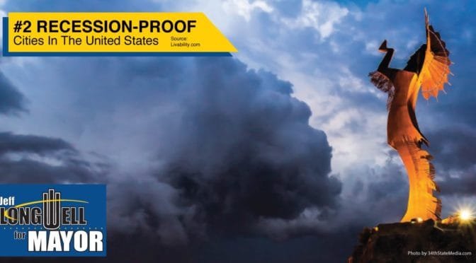
Campaigning on Wichita as recession-proof
The City of Wichita and Mayor Jeff Longwell shouldn’t be using flimsy evidence that is contrary to actual economic data.
-
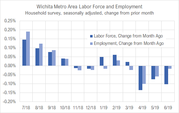
Wichita jobs and employment, June 2019
For the Wichita metropolitan area in May 2019, the labor force is up, the number of unemployed persons is up, the unemployment rate is unchanged, and the number of people working is up when compared to the same month one year ago. Seasonal data shows declines in labor force and jobs from April.
-
Kansas GDP
In the first quarter of 2019, the Kansas economy grew at the annual rate of 3.1 percent, up from 0.9 percent the previous quarter.
-

Kansas jobs, June 2019
Employment and the labor force in Kansas fell slightly in June 2019, and continued a trend of mostly slower growth than the nation over the year.
-
Metropolitan employment and labor force
A visualization of employment, labor force, and unemployment rate for metropolitan areas, now with data through May 2019.