Following are visualizations of data. Many are interactive and created using Tableau Public. In some cases I’ve recorded myself using the visualization to tell a story, and all you have to do is watch.
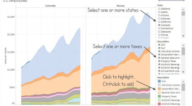
Kansas tax receipts by category, presented in an interactive visualization.
The Kansas Division of the Budget publishes monthly statistics regarding tax collections. These figures have been gathered and are presented in an interactive visualization.
Example from the visualization.For the past two years, individual income tax collections have been relatively flat. There are variations each month, but overall the trend is slightly up. Corporate income tax collections are on a slight downward trajectory.
Retail sales tax and compensating use tax have been rising for two years. A higher sales tax rate took effect on July 1, 2015, with the rate rising from 6.15 percent to 6.50 percent.
Cigarette taxes have risen rapidly since July 2015 when higher tax rates on these products took effect. The same trend is present in the tobacco products tax.
Severance taxes — tax collected on natural gas and oil as it is extracted from the ground — have been on a downward trend as prices for these produces have fallen. This is a sizable tax. In June 2014 collections of this tax were running at about $143 million per year. Two year later the rate is $28 million annually.
Click here for the most current version of the visualization.
This article and visualization have been updated. Click here.
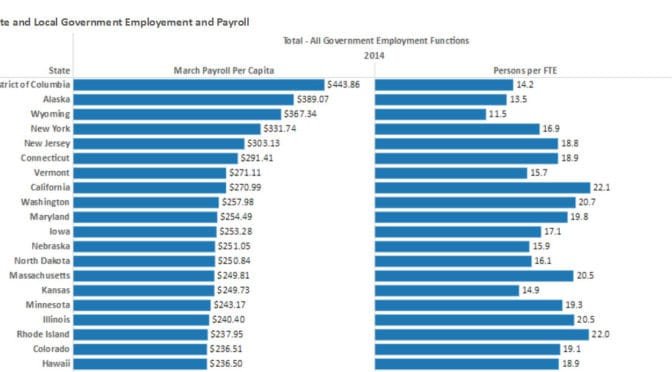
Considering all state and local government employees in proportion to population, Kansas has many, compared to other states, and especially so in education.
State and Local Government Employee and Payroll. Click for larger.When considering all state and local government employees, Kansas spent $249.73 per person on payroll (March only).1 This was 15th highest among the states, District of Columbia, and nation as a whole. There were 14.9 citizens for each FTE (full-time equivalent employee), which ranks fourth highest.
In other words, Kansas has many government employees compared to other states, and these employees are costly, again compared to other states.
When considering all elementary and secondary education employees, Kansas spent $93.36 per person on payroll (March only). This was 15th highest among the states, District of Columbia, and nation as a whole. There were 33.8 citizens for each FTE (full-time equivalent employee), which ranks third highest.
In other words, Kansas has many elementary and secondary education employees compared to other states, and these employees are costly, again compared to other states.
Similar results are found for higher education employees. Fortunately, Kansas has zero employees working in state-owned liquor stores.
In the visualization you may create your own tables. Click here to access the visualization. Source of data is U.S. Census Bureau.2 Visualization created using http://www.census.gov/govs/apes/.
—
Notes
For total payroll (both full-time and part-time employees), the Census Bureau reports a value for a single month, that being March. ↩
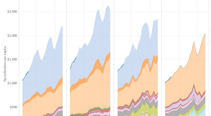
State and Local Direct General Expenditures, Per Capita, Kansas highlighted.An interactive visualization of state and local direct general expenditures, per capita. Click here to use the visualization.
Data is from State & Local Government Finance Data Query System. Available here. The Urban Institute-Brookings Institution Tax Policy Center. Data from U.S. Census Bureau, Annual Survey of State and Local Government Finances, Government Finances, Volume 4, and Census of Governments (1977-2013). Date of Access: (20-Jun-2016).
An interactive visualization of gross domestic product by state and industry.
The Bureau of Economic Analysis, an agency of the United States Department of Commerce, has released Gross Domestic Product figures for the year 2015. I’ve gathered this data and present in it an interactive visualization using Tableau Public. This data is grouped by states and regions, and also by major categories of industry.
Of note: The list of industries is not exclusive. That is, some categories such as “All industry total” and “Private industries” contain other categories. Use caution when selecting multiple categories.
An interactive visualization of tax collections by state governments shows Kansas distinguished from some of its neighbors.
Note: this visualization has been updated. Click here for the most recent version.
Per-capita tax collections, Kansas and nearby states. Click for larger.As shown in the nearby illustration, Kansas collects more taxes than some nearby states, on a per-person basis. This information should guide Kansas legislators and policymakers and Kansas prepares to balance its budget. Does Kansas want to further separate itself from its neighbors with even higher taxes?
The values are from the United States Census Bureau, and are for tax collections by the state only. Local governmental entities like cities, counties, townships, improvement districts, cemetery districts, library districts, drainage districts, watershed districts, and school districts are not included.
You may use this interactive visualziaton to prepare your own analysis and illustrations. Of particular interest is the “State Total” tab. Here you can select a number of states and compare their tax burdens. (Probably three or four states at a time is the practical limit.)
An interactive visualization of gross domestic product by state and industry from the Bureau of Economic Analysis.
Composition of GDP by State, Kansas and U.S. Click for larger version.The Bureau of Economic Analysis is an agency of the United States Department of Commerce. BEA describes its role as “Along with the Census Bureau, BEA is part of the Department’s Economics and Statistics Administration. BEA produces economic accounts statistics that enable government and business decision-makers, researchers, and the American public to follow and understand the performance of the Nation’s economy. To do this, BEA collects source data, conducts research and analysis, develops and implements estimation methodologies, and disseminates statistics to the public.”
A relatively new series of data produced by BEA is gross domestic product (GDP) by state for 21 industry sectors on a quarterly basis. BEA defines GDP as “the value of the goods and services produced by the nation’s economy less the value of the goods and services used up in production.” It is the value of the final goods and services produced.
In describing this data, BEA says “These new data provide timely information on how specific industries contribute to accelerations, decelerations, and turning points in economic growth at the state level, including key information about the impact of differences in industry composition across states.” This data series starts in 2005.
I’ve gathered the data for this series for all states and present it in an interactive visualization using Tableau Public. I present the series in real dollars, meaning that BEA adjusted the numbers to account for changes in the price level, or inflation.
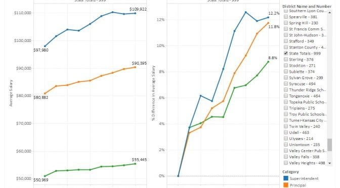
Kansas school salaries for superintendents, principals, and teachers presented in an interactive visualization for each district, updated for 2016 data.
In the article, David Dorsey writes: “A widely-shared solution to improving student outcomes is to put more money in the classroom. What does it say about the importance of student achievement to local school boards and administrations when pay increases are disproportionately higher to those who are not in the classroom?”
And later: “Much has been documented about teacher shortages, especially due to those leaving after only a few years in the profession. One way to reverse that trend would be for districts to make spending choices that would support the commitment to keeping quality teachers.”
Kansas State Department of Education has released salary figures for districts for the current school year, fiscal year 2016. Statewide, since 2008, the KSDE data shows these cumulative salary increases:
If we start the comparison in 2009 the difference is larger, with increases of 8.2 percent for principals and 4.9 percent for teachers.
It’s also useful to look at individual districts. For example, for the Wichita public school district, there are these cumulative salary increases since 2008:
The Wichita district has just one superintendent, so no matter how much the salary rises, it’s still the salary for just a single person and has a negligible effect on total district payroll costs. There are, however, 89 principals, so the increase for this category of employee matters much more.
But you have to wonder: What about the teachers?
I’ve gathered the data and present it in an interactive visualization. You may select any single district, or use district 999 for statewide totals. Click here to open the visualization in a new window. Data is from Kansas State Department of Education. Figures include fringe benefits and are not adjusted for inflation. Visualization created using Tableau Public. There are several missing values which can make the percentage change invalid for a single year.
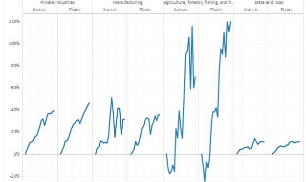
During this century the Kansas economy has not kept up with the national economy and most neighboring states.
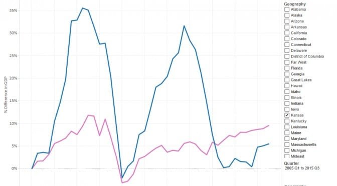
The Federal Reserve Bank of Philadelphia calculates two indexes that track and forecast economic activity in the states and the country as a whole.
The coincident index is a measure of current and past economic activity for each state. This index includes four indicators: nonfarm payroll employment, the unemployment rate, average hours worked in manufacturing, and wage and salary disbursements deflated by the consumer price index (U.S. city average). July 1992 is given the value 100. 1
The leading index predicts the six-month growth rate of the state’s coincident index. In addition to the coincident index, “the models include other variables that lead the economy: state-level housing permits (1 to 4 units), state initial unemployment insurance claims, delivery times from the Institute for Supply Management (ISM) manufacturing survey, and the interest rate spread between the 10-year Treasury bond and the 3-month Treasury bill.” 2
Positive values mean the coincident index is expected to rise in the future six months, while negative values mean it is expected to fall.
I’ve created an interactive visualization of these two indexes. Examples appear nearby. Click here to use the visualization in a new window.
An interactive visualization of tax collections by state governments.
Note: this visualization has been updated. Click here for the most recent version.
Each year the United States Census Bureau collects data from the states regarding tax collections in various categories. I present this data starting in 1993, in an interactive visualization.
The values are for tax collections by the state only, not local governmental entities like cities, counties, townships, improvement districts, cemetery districts, library districts, drainage districts, watershed districts, and school districts.
Of particular interest is the “State Total” tab. Here you can select a number of states and compare their tax burdens. (Probably three or four states at a time is the practical limit.)