Following are visualizations of data. Many are interactive and created using Tableau Public. In some cases I’ve recorded myself using the visualization to tell a story, and all you have to do is watch.
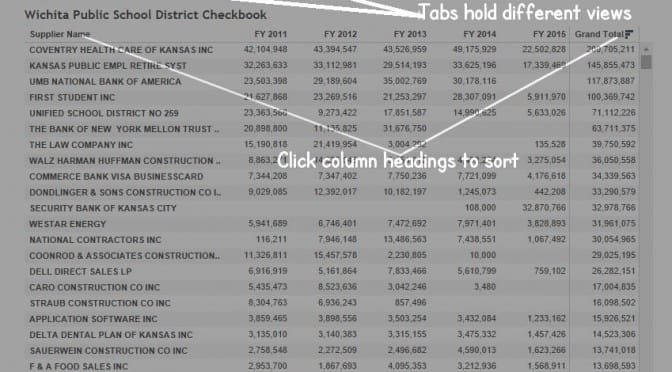
USD 259, the Wichita public school district, makes its monthly checkbook register available. I’ve gathered the monthly spreadsheets made the consolidated available for analysis through Tableau Public.
The workbook (click here to open it in a new window) has a number of tabs, each showing the same data organized and summarized in a different way.
There are some caveats. First, not all school district spending is in this database. For each year, the total of the checks is in the neighborhood of $350 million, while the total spending for USD 259 is over $600 million. So there’s spending that isn’t included in this checkbook data.
Second, there are suppliers such as “Commerce Bank Visa BusinessCard.” Payments made to this supplier are over $7 million per year. These payments from the district’s checkbook undoubtedly pay a credit card bill, and this alone doesn’t let us know what the $7 million was spent on.
There are some data quality issues, as seen nearby.
USD 259 supplies this advice with this data: “The information you find may cause you to ask more questions. If so, the person to contact is Wichita Public School’s Controller, Barbara Phillips. She can be reached at (316) 973-4628, or at bphillips@usd259.net.”
Here is an interactive visualization of private nonfarm employment in Kansas, for each county. Data is from Bureau of Economic Analysis, part of the U.S. Department of Commerce. Click here to open the visualization.
The sample below shows job growth for the state as a whole, along with the five largest counties. Click it for a larger version.
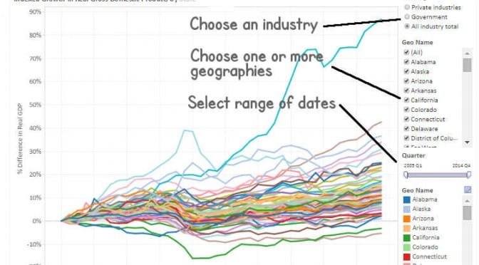
Today, the U.S. Bureau of Economic Analysis (BEA) is releasing prototype quarterly gross domestic product (GDP) by state statistics for 2005–2014. The quarterly GDP by state statistics are released for 21 industry sectors and are in both current and inflation-adjusted chained (2009) dollars.
The new data are intended to provide a fuller description of the accelerations, decelerations, and turning points in economic growth at the state level, including key information about the impact of industry composition differences across states. Relative to the August 2014 release, the new prototype statistics incorporate new and revised source data and cover an additional year of economic activity.
Statistics for the first quarter of 2015 are not being released as BEA continues to evaluate its methodology based on data users’ comments and evaluations received after the first release of prototype quarterly GDP by state statistics last September.
I’ve gathered a subset of the data and present it in an interactive visualization. In this subset, I include only these industries: All industry, Private industry, and Government. Click here to open the visualization in a new window.
Examining tax collections by the states shows that Kansas collects more tax than many of our neighbors, and should put to rest some common myths.
Tax Collections by the States, Kansas and selected States, total and per capita.Of a selection of nearby states, Kansas collects more taxes than most, on a per-person basis. The nearby table shows total tax collections, and tax collections per person. The chart shows collections grouped by major category, and one special category, which is severance taxes.
Some of the data regarding specific taxes is revealing and should shape the debate over taxes in Kansas. Consider severance taxes, which are taxes levied on extracting materials like oil, gas, and coal. The common narrative in Kansas is that states like Texas are sitting atop a sea of oil, with the severance taxes funding a major portion of state government. The data shows that Texas collected $223 per person in severance taxes in 2014. For Kansas the figure is $43. This difference — $180 — doesn’t account for the difference in total tax collections between the states. Texas collects $2,050 in total taxes per person, while Kansas collects $2,526, a difference of $476.
Tax Collections by the States, Kansas and selected States, 2014. Click for larger version.We also commonly hear that Kansas doesn’t have the tourism of states like Florida, and therefore doesn’t have the flood of tourism spending and accompanying sales tax. Again, looking at the data, se see that Florida collected $1,460 in Sales and Gross Receipt Taxes per person for 2014. Kansas collected $1,340. This is a difference of $120, while the difference between total tax collections for Florida ($1,779) and Kansas ($2,526) is $747.
You may use this interactive visualization to customize the table to fit your own needs. Click here to open the visualization. Data is from the U.S. Census Bureau, Survey of State Government Tax Collections and Bureau of Economic Analysis, along with author’s calculations. Visualization developed using Tableau Public. Data is expressed on a per person basis, not adjusted for inflation.
To see how your state compares with others in spending, use the interactive visualization below. The figures presented are per-person, and not adjusted for inflation. Figures for 2015 are estimates.
If the Kansas public school establishment wants to present an accurate assessment of Kansas schools, it should start with its presentation of NAEP scores.
Kansas public school leaders are proud of Kansas schools, partly because of scores on the National Assessment of Educational Progress (NAEP), known as “The Nation’s Report Card.” Kansas ranks high among the states on this test. It’s important, however, to examine the results from a few different angles to make sure we understand the entire situation.
I’ve gathered scores from the 2013 administration of the test, which is the most recent data available. I present data in an interactive visualization that you may use through the links at the end of this article. The most widely available NAEP data is for two subjects: reading and math, and for two grades, fourth and eighth. In the nearby images captured from the visualizations, I present data for Kansas and the average for national public schools. I’ve also added Texas and Florida, as schools in those states have sometimes been mentioned in comparisons to Kansas. The numbers in the charts are the percent of students that score at or above proficient.
NAEP scores grouped by ethnicity. Click for larger version.
Considering all students, Kansas has the best scores for all combinations of grade levels and subjects, except for one.
When we compare black students only, we find Kansas outperformed by Texas in all cases. National public schools beat Kansas in one case, and tie in another.
Looking at Hispanic students only, Florida beats Kansas in three cases and ties in one. In some cases the difference is large.
Looking at white students only, Texas outperforms Kansas in all cases. National public schools score higher than Kansas in three of four cases.
Another way to look at test scores is to group students by eligibility for free or reduced school lunches. This is a widely used surrogate for family income. In this analysis Kansas performs better in comparison to other states, but Kansas is not always the best.
NAEP scores grouped by free/reduced lunch eligibility. Click for larger version.
These visualizations are interactive, meaning that you may adjust parameters yourself. For the visualization grouping students by ethnicity, click here. For the visualization grouping students by school lunch eligibility, click here.
When comparing Kansas school test scores to those of other states or the nation, it’s important to consider disaggregated data. Otherwise, we may make inaccurate conclusions regarding Kansas schools.
Kansas school leaders are proud of Kansas schools, partly because of scores on the National Assessment of Educational Progress (NAEP), known as “The Nation’s Report Card.” Kansas ranks pretty high among the states on this test. It’s important, however, to examine the results from a few different angles to make sure we understand the entire situation.
NAEP test scores subdivided by ethnicity. Click for larger version.I’ve gathered scores from the 2013 administration of the test, which is the most recent data available. I present them in a visualization that you can use yourself through the links at the end of this article. The most widely available NAEP data is for two subjects: reading and math, and for two grades, fourth and eighth. In the nearby images captured from the visualizations, I present data for Kansas and the average for national public schools. The numbers are the percent of students that are at or above proficient.
Looking at the data for all students, you can see why Kansas school leaders are proud: The line representing Kansas is almost always the highest. But there are important statistical considerations to take into account.
NAEP makes data available by ethnic subtypes. If we present a chart showing black students only, something different appears. In some instances the line for national public schools coincides with the Kansas line, or is above the Kansas line. A similar pattern exists when considering Hispanic students only.
Perhaps surprisingly, when considering white students only, the same pattern exists: In many cases national public schools white students score as well as, or sometimes above, Kansas white students.
NAEP test scores subdivided by eligibility for free or reduced lunch. Click for larger version.Looking at the data subgroups by eligibility for free or reduced price lunches is useful, too. This eligibility is a commonly-used surrogate for selecting students from low-income households. When looking at the subgroups, the advantage of Kansas schools sometimes disappears, although the effect is not as marked.
How can this be? The answer is Simpson’s Paradox. A Wall Street Journal article explains: “Put simply, Simpson’s Paradox reveals that aggregated data can appear to reverse important trends in the numbers being combined.”
The Wikipedia article explains: “A paradox in which a trend that appears in different groups of data disappears when these groups are combined, and the reverse trend appears for the aggregate data. … Many statisticians believe that the mainstream public should be informed of the counter-intuitive results in statistics such as Simpson’s paradox.”
A more technical paper gives this definition: “Simpson’s paradox refers to a phenomena whereby the association between a pair of variables (X, Y ) reverses sign upon conditioning of a third variable, Z, regardless of the value taken by Z.”
In this case, the confounding factor (“lurking” variable) is that Kansas differs greatly from national public schools in the proportion of students in ethnic groups. Most prominently, in Kansas, 68 percent of students are white. For national public schools, the value is 51 percent.
This large difference in the composition of students is what makes it look like Kansas students perform better on the NAEP than the national average. But looking at the scores for ethnic subgroups, can we still say that Kansas schools outperform national public schools? It’s important to know that aggregated data can mask or hide underlying trends.
Note that there is not much difference in eligibility for free or reduced lunches between Kansas and national public schools. This is why Simpson’s Paradox is not strongly apparent in these scores.
Have you heard Kansas school leaders talk about this? Or do they present Kansas NAEP test scores without considering the different makeup of the states?
The interactive visualizations of NAEP scores are not difficult to use. The adjustment most people may want to make is selecting a different combination of states. Click here to access the visulizations.
An interactive visualization with four views of the populations of the states, 1900 to 2014. Use below, or click here to open in a new window, which will probably work best.
During this century the Kansas economy has not kept up with the national economy and most neighboring states.
The Federal Reserve Bank of Philadelphia calculates two indexes that track and forecast economic activity in the states and the country as a whole.
Coincident Economic Activity Index, Kansas highlighted against neighboring states.The coincident index is a measure of current and past economic activity for each state. This index includes four indicators: nonfarm payroll employment, the unemployment rate, average hours worked in manufacturing, and wages and salaries. July 1992 is given the value 100.
The leading index predicts the six-month growth rate of the state’s coincident index. In addition to the coincident index, “the models include other variables that lead the economy: state-level housing permits (1 to 4 units), state initial unemployment insurance claims, delivery times from the Institute for Supply Management (ISM) manufacturing survey, and the interest rate spread between the 10-year Treasury bond and the 3-month Treasury bill.”
Leading Index, Kansas highlighted against neighboring states.Positive values mean the coincident index is expected to rise in the future six months, while negative values mean it is expected to fall.
I’ve created an interactive visualization of these two indexes. Examples appear nearby. Click here to open the visualization in a new window. You may select a range of dates and one or more states to include on the chart. Click on a state’s legend color to spotlight it against other states.
 There are some data quality issues, as seen nearby.