Tag: Visualizations

Following are visualizations of data. Many are interactive and created using Tableau Public. In some cases I’ve recorded myself using the visualization to tell a story, and all you have to do is watch.

  • Kansas school employment: The statistics and the claims

    Kansas school employment: The statistics and the claims

    School

    Claims made about Kansas schools don’t match the state’s statistics.

    Responding to the State of the State Address delivered by Kansas Governor Sam Brownback, Kansas House of Representatives Minority Leader and gubernatorial candidate Paul Davis provided figures regarding Kansas public schools, telling Kansans: “On top of that, public school class sizes are growing, [and] teachers have been laid off by the thousands.”

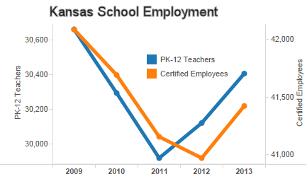
    Statistics from Kansas State Department of Education, however, show that school employment has rebounded, both in terms of absolute numbers of teachers and certified employees, and the ratios of pupils to these employees.

    Kansas school employment

    The story is not the same in every district. But considering the entire state, two trends emerge. For the past two years, the number of teachers employed in Kansas public schools has risen. Correspondingly, the pupil-teacher ratio has fallen. (This ratio is not the same statistic as average class size, but it’s the data we have. Plus, if schools are hiring teachers at a rate higher than the increase in students, we should expect class sizes to fall.)

    Kansas school employment ratios

    The trend for certified employees is a year behind that of teachers, but for the last year, the number of certified employees has risen, and the ratio to pupils has fallen.

    I’ve created interactive visualizations that let you examine the employment levels and ratios in Kansas school districts. Click here for the visualization of employment levels. Click here for the visualization of ratios (pupil-teacher and pupil-certified employee). Data is from Kansas State Department of Education. Visualization created by myself using Tableau Public.

    There’s also this to consider about class size. In 2011 the Center for American Progress released a report about class size reduction in schools and the false promise it holds for improving student achievement. (The False Promise of Class-Size Reduction)

    It’s quite astonishing to see CAP cite evidence from Eric Hanushek of the Hoover Institution and Caroline Hoxby of Stanford and Hoover. These two researchers are usually condemned by the public education establishment and bureaucracy, including teachers unions. These are some of the key constituents CAP usually caters to.

    In a nutshell, class size reduction produces very little benefit for students. It’s also very expensive, and there are other things we should be doing instead if we really want to increase student achievement.

    The report summarizes the important studies in class size reduction. The upshot is that there is only one study showing positive results from class size reduction, and that effect was found only among the early grades. The effect decreased after a few years, even though small class sizes were still used.

    The report also notes that class size reduction is very expensive to implement. Because it is, the report says we should look to other ways to increase student achievement, such as policies relating to teacher effectiveness: “The emerging consensus that teacher effectiveness is the single most important in-school determinant of student achievement suggests that teacher recruitment, retention, and compensation policies ought to rank high on the list.”

    On teacher quality and teacher effectiveness: When Sandi Jacobs of National Council for Teacher Quality appeared in Kansas a few years ago, we learned that Kansas ranks below average on its policies that promote teacher quality.

    In the example she illustrated, third graders who had teachers in the top 20 percent of effectiveness for the next three years went from the 50th percentile in performance to the 90th. For students with teachers in the lowest 20 percent for the same period, their performance dropped from the 50th percentile to the 37th percentile. More on this topic is at Kansas ranks low in policies on teacher quality.

  • Kansas school test scores must be evaluated considering demographics

    Kansas school test scores must be evaluated considering demographics

    line-chart-01When comparing Kansas school test scores to those of other states, it’s important to consider disaggregated data. Otherwise, we may form an inaccurate and unfounded impression of Kansas schools.

    Kansas school leaders are proud of Kansas schools, partly because of scores on the National Assessment of Educational Progress (NAEP), known as “The Nation’s Report Card.” Kansas ranks pretty high among the states on this test. It’s important, however, to examine the results from a few different angles to make sure we understand the entire situation. An illustrative video is available here, or at the end of this article.

    Data for the 2013 administration of the test was just released. I’ve gathered scores and made them available in a visualization that you can use by clicking here. The most widely available NAEP data is for two subjects: reading and math, and for two grades, fourth and eighth. The video presents data for Kansas, Texas, and the average for national public schools. I choose to compare Kansas with Texas because for several reasons, Kansas has been comparing itself with Texas. So let’s look at these test scores and see if the reality matches what Kansas school leaders have said.

    Looking at the data for all students, you can see why Kansas school leaders are proud: The line representing Kansas is almost always the highest. This data considers the state as a whole, and ignores important statistical considerations.

    NAEP makes data available by ethnic subtypes. If we present a chart showing black students only, something different appears. Now Texas is higher than Kansas in all cases in one, where there is a tie.

    If we consider Hispanic students only: Texas is higher in some cases, and Kansas and Texas are virtually tied in two others. National public schools is higher than Kansas in some cases.

    Considering white students only, Texas is higher than Kansas in three of four cases. In some cases the National public school average beats or ties Kansas.

    So we have what seems to be four contradictory statements, but each is true.

    • When considering all students: Kansas scores higher than Texas.
    • Hispanic students only: Kansas is roughly equal to Texas.
    • Black students only: Kansas scores below Texas.
    • White students only: Kansas scores below Texas in most cases.

    How can this be? The answer is Simpson’s Paradox. A Wall Street Journal article explains: “Put simply, Simpson’s Paradox reveals that aggregated data can appear to reverse important trends in the numbers being combined.”

    The Wikipedia article explains: “A paradox in which a trend that appears in different groups of data disappears when these groups are combined, and the reverse trend appears for the aggregate data. … Many statisticians believe that the mainstream public should be informed of the counter-intuitive results in statistics such as Simpson’s paradox.”

    In this case, the confounding factor (“lurking” variable) is that the two states differ greatly in the proportion of students in ethnic groups. For example, in Kansas, 69 percent of students are white. In Texas it’s 33 percent. This large difference in the composition of students is what makes it look like Kansas students perform better on the NAEP than Texas students.

    But looking at the scores for ethnic subgroups, which state would you say has the most desirable set of NAEP scores? It’s important to know that aggregated data can mask or hide underlying trends.

    Here’s a question for you: Have you heard Kansas school leaders talk about this? Or do they present Kansas NAEP test scores without considering the different makeup of the states?

  • Kansas school test scores, the subgroups

    To understand Kansas school test scores, look at subgroups.

    Kansans are proud of their public schools. The public school education establishment refers with pride to top-ten rankings among the states on the National Assessment of Educational Progress (NAEP), known as “The Nation’s Report Card.”

    In his recent State of the State Address, Kansas Governor Sam Brownback made a similar claim, stating “According to the most recent National Assessment of Educational Progress, Kansas fourth graders are in one of the 10 best states for reading proficiency.”

    naep-data-explorer-logo
    If we’re going to rely on the NAEP test as evidence of the goodness of Kansas public schools, we should take a critical look at the scores. I’ve gathered NAEP test score data from the NAEP Data Explorer at the National Center for Education Statistics and made the data available in an interactive visualization.

    competition-ranking-example
    This visualization uses “competition” ranking in the way it handles ties. In this example, the first three states have the same score, so they are all ranked “1.” The next state is ranked “4.”

    This means that the rank values will always reach to 50, except for instances where there is missing or incomplete data. Actually, this data set extends to rank 52, as it contains the District of Columbia and the national average. I’ve also rounded the reported scores to integer values.

    To look at the governor’s claim: For all students in 2013, Kansas ranked 9 in grade 4 math, and 7 in grade 8 math. In reading, Kansas ranked 22 for grade 4, and 26 for grade 8. In his speech, the governor claimed Kansas was top 10 in reading. But it’s in math that Kansas students did that well. Reading scores are more toward the middle of the states.

    The importance of subgroups

    If we really want to gain understanding of how Kansas compares to other states on the NAEP, we need to take a look at subgroups of students, particularly subgroups based on race/ethnicity. The visualization of NAEP scores lets us do that.

    naep-rankings-states-example-2014-01
    Start with math for grade 4. We see these rankings for the major subgroups:
    All students, 9
    Black, 8
    Hispanic, 11
    White, 17

    For math, grade 8:
    All students, 7
    Black, 10
    Hispanic, 13
    White, 14

    For reading, grade 4:
    All students, 22
    Black, 20
    Hispanic, 26
    White, 19

    For reading, grade 8:
    All students, 26
    Black, 24
    Hispanic, 37
    White, 33

    Kansans should not be proud of some of these results. For grade 8 reading, the scores for Hispanic and White students rank lower than the national average.

    Another dimension for creating subgroups is based on poverty. NAEP uses eligibility for the national school lunch program as a proxy for poverty. If a student is eligible for the lunch program, the student is considered to be poor.

    Starting again with math grade 4, here are the rankings among the states for Kansas:
    All students, 9
    Eligible, 4
    Not eligible, 12

    For math, grade 8:
    All students, 7
    Eligible, 8
    Not eligible, 6

    For reading, grade 4:
    All students, 22
    Eligible, 20
    Not eligible, 13

    For reading, grade 8:
    All students, 26
    Eligible, 28
    Not eligible, 15

    Some of the grade 8 reading rankings are lower than the national average.

    As you can see, sometimes Kansas ranks very well among the states. In other instances, Kansas ranks much lower, even below the national average. It’s important for Kansans — be they citizens, schoolchildren, parents, education professionals, or (especially) politicians of any party — to understand these scores. If we don’t, we risk failing to recognize both the good things about Kansas schools and the areas that need improvement. Especially for the latter case, it’s Kansas schoolchildren who will suffer if we are not honest.

    There are two visualizations that you may use. Click here to open the visualization for race/ethnicity in a new window. Click here to open the visualization for national lunch program eligibility in a new window.

  • Kansas gross domestic product

    Seal of the State of KansasSince 1997, Kansas gross domestic product has grown 89.1 percent. The United States as a whole has grown 88.2 percent.

    Considering compound annual rate of growth for the same period, the rate for Kansas is 4.34 percent, and for the U.S. the rate is 4.31 percent.

    So the record for Kansas is right about in the middle of the states. Not good, but not bad either.

    kansas-michigan-gdp-2014-01

    Of note: Kansas Democrats have announced their speaker for their annual Washington Days celebration. It’s Jennifer Granholm, who was governor of Michigan from 2003 to 2011. In the nearby illustration (click it for larger version) of state GDP, Kansas is highlighted in blue. The green line that stands out from all other states is Michigan.

    Using the visualization.
    Using the visualization.
    If you’d like to use the interactive visualization of state GDP data, you may click here to open it in a new window. Data is from U.S. Bureau of Economic Analysis along with author’s own calculations. Visualization created using Tableau Public.

  • Wichita’s growth in gross domestic product

    Wichita City HallCompared to peer areas, Wichita’s record of growth in gross domestic product is similar to that of job creation: Wichita performs poorly.

    Looking at growth in GDP, Wichita lags behind the metropolitan statistical areas that we consider our peers (according to Visioneering Wichita), but not behind all the peer cities that I selected. Wichita does better than Springfield, Illinois, for example. I chose to include that as a peer metropolitan area because that’s the immediate past city that Gary Plummer worked in. He was president of that city’s Chamber of Commerce, and is now president of the Wichita Metro Chamber of Commerce.

    Wichita also does better than Wichita Falls, Texas. That city is the immediate past home of Tim Chase. He was the head of Wichita Falls Economic Development Corporation. He’s now president of Greater Wichita Economic Development Coalition, the primary organization in charge of economic development for the Wichita area.

    What Wichita is missing

    If the Wichita-area GDP grew faster, Wichita could generate many more jobs.

    growth-gdp-metropolitan-area-wichita-2012-01From 2001 to 2012, Wichita GDP grew at a rate of 0.734 percent per year, compounded annually. U.S. Metropolitan areas, as a whole, managed 1.571 percent growth over the same period. That seems like a small difference, just 0.837 percentage points. But over time, compounding adds up, so to speak. Here’s what it could amount to.

    GDP in the Wichita MSA in 2012 was $29,644 million (current dollars). For that year the number of people working averaged 285,600, so each job contributed, on average, $103,796 to GDP.

    A metropolitan area the size of Wichita that grew at the historic growth rate of all U.S. Metropolitan areas would be producing an additional $2,751 million in GDP in ten years, compared to a metropolitan area growing at Wichita’s historical rate. That could mean an additional 26,000 jobs.

    Using the visualization.
    Using the visualization.
    If you’d like to use the interactive visualization of metropolitan GDP data, you may click here to open it in a new window. Data is from U.S. Bureau of Economic Analysis along with author’s own calculations. Visualization created using Tableau Public.

  • Kansas schoolchildren shortchanged by Kansas City Star

    kansas-city-star-opinionAnother newspaper editorialist ignores the facts about Kansas schools. This is starting to be routine.

    In a collection of toasts and roasts, Kansas City Star columnist Steve Rose criticizes Kansas Governor Sam Brownback on a variety of fronts, especially on school funding:

    A ROAST to Kansas Gov. Sam Brownback, who led the charge for the most radical and irresponsible tax cuts in the history of Kansas and, perhaps, the entire country. One of the unfortunate victims of these cuts is education, both K-12 and higher education. The damage will be gradual, but it will be felt to be sure. Brownback says he is investing in more jobs. But he is dis-investing in education. What could be more vital to the Kansas economy and attracting businesses than a high quality educational system? (Roasts and toasts suitable for the new year, January 11, 2014)

    kansas-school-spending-per-student-2013-10-chart-01

    Dis-investing in education.: Nearby is a chart of Kansas school spending. It’s adjusted for inflation. Spending is not as high as it was at its peak, but claims of “slashing” or “dis-investing” don’t apply, either.

    Those who claim school spending is inadequate usually cite only base state aid per pupil, which has fallen. But it’s only the starting point for all the other spending. In totality, spending on schools in Kansas is over three times the level of base state aid. Also, comparisons are often made to what the Kansas Supreme Court said base state aid should be to its actual value. But the court doesn’t know how much should be spent on schools.

    Those who make claims of cutting schools should note this: Considering the entire state, two trends have emerged. For the past two years, the number of teachers employed in Kansas public schools has risen. Correspondingly, the student-teacher ratio has fallen. The trend for certified employees is a year behind that of teachers, but for the last year, the number of certified employees has risen, and the ratio to pupils has fallen.

    Kansas school employment

    I’ve created interactive visualizations that let you examine the employment levels and ratios in Kansas school districts.

    Kansas school employment ratios

    Click here for the visualization of employment levels. Click here for the visualization of ratios (pupil-teacher and pupil-certified employee).

    What could be more vital to the Kansas economy and attracting businesses than a high quality educational system? Rose is right. Good schools are vital to our future. If only Kansas had them.

    The focus on school spending — that’s all writers like Rose write about — keeps attention away from some unfortunate and unpleasant facts about Kansas schools. Kansas needs to confront these facts for the sake of Kansas schoolchildren. Editorials like this are very harmful to Kansas schoolchildren, because if spending is increased, not much is likely to improve, but the public school establishment and editorialists like Steve Rose will say that everything that’s wrong has been fixed.

    Here’s what Kansas needs to confront. Regarding Kansas school performance, we have to confront two unpleasant realities. First, Kansas has set low standards for its schools, compared to other states. Then, when the Kansas Supreme Court ordered more spending in 2005, the state responded by lowering school standards further. Kansas school superintendents defend these standards.

    When referring to “strong public school system,” here’s what Kansans need to know. On the National Assessment of Educational Progress (NAEP), known as “The Nation’s Report Card.” Kansas ranks pretty high among the states on this test. It’s important, however, to examine the results from a few different angles to make sure we understand the entire situation. An illustrative video is available here.

    Kansas and National NAEP Scores, 2011, by Ethnicity and Race

    If we compare Kansas NAEP scores to those of Texas, we have what seems to be four contradictory statements, but each is true.

    • When considering all students: Kansas scores higher than Texas.
    • Hispanic students only: Kansas is roughly equal to Texas.
    • Black students only: Kansas scores below Texas.
    • White students only: Kansas scores below Texas in most cases.

    What explains this paradox is that the two states differ greatly in the proportion of students in ethnic groups. In Kansas, 69 percent of students are white. In Texas it’s 33 percent. This large difference in the composition of students is what makes it look like Kansas students perform better on the NAEP than Texas students.

    But looking at the scores for ethnic subgroups, which state would you say has the most desirable set of NAEP scores? It’s important to know that aggregated data can mask or hide underlying trends.

    Here’s a question for you: Have you heard Kansas school leaders talk about this? Do Steve Rose and the Kansas City Star editorial board know this?

  • For Wichita’s economic development machinery, failure

    Delano Clock Tower, WichitaCompared to a broad group of peer metropolitan areas, Wichita performs very poorly. As Wichita embarks upon a new era of economic development, we need to ask who to trust with this important task.

    The good news: In a recent op-ed, Wichita Mayor Carl Brewer wrote that the city needs to make a decision regarding “A more aggressive approach to job creation.” (Carl Brewer: Wichita can have a great next year, December 22, 2013 Wichita Eagle)

    The bad news: Wichita has performed very poorly in job creation in recent decades, and even if we decide on a more aggressive approach, pretty much the same crew is in charge.

    Many in Wichita don’t want to recognize and confront the bad news about the performance of the Wichita-area economy. Last year, when presenting its annual report to local governmental bodies, the leaders of Visioneering Wichita would not present benchmark data to elected officials.

    Some, however, have recognized the severity of the problem. In 2008 Harvey Sorensen, who has been chair of Visioneering Wichita, chair of the Wichita Metro Chamber of Commerce, and has held other civic leadership positions, wrote in the pages of the Wichita Eagle: “We are losing ground competitively with our peer communities.” (Community Needs a Common Vision, August 24, 2008 Wichita Eagle)

    wichita-peer-job-growth-1990-2014-01

    So what is the record of the Wichita metropolitan area regarding job creation, that seeming to be the most popular statistic our leaders cite and promote? I’ve prepared statistics from the Bureau of Labor Statistics, U.S. Department of Labor for Wichita and a broad group of peer cities. I included our Visioneering peer cities, cities that Visioneers traveled to on official visits, and a few others. The result, shown nearby, is not pretty. (Click on charts for larger versions, or click here to use the interactive visualization)

    wichita-peer-job-growth-2007-2014-01

    If we look at job creation starting in 1990, Wichita lags behind our Visioneering peers, but not behind all the peer cities that I selected. Wichita does better than Springfield, Illinois, for example. I chose to include that as a peer metropolitan area because that’s the immediate past city that Gary Plummer worked in. He was president of that city’s Chamber of Commerce, and is now president of the Wichita Chamber. Note the position of Springfield: Last place.

    In next-to-last place we see Wichita Falls, Texas. I chose to include it because it is the immediate past home of Tim Chase. He was the head of Wichita Falls Economic Development Corporation. He’s now president of Greater Wichita Economic Development Coalition, the primary organization in charge of economic development for the Wichita area.

    In second-to-last place we see Pittsburgh, which I added because Visioneering leaders recently made a visit there.

    Then, we come to Wichita.

    If we look at job creation since 2007, the year before Sorensen wrote his op-ed, we find Wichita in a common position: Last place in job creation, and by a wide margin except for two cities. One is Wichita Falls, where our present GWEDC president recently worked. The other city that barely out-performs Wichita is Chattanooga, which I included because Visioneering civic leaders recently traveled there to learn from that city.

    Over the decades in which Wichita has performed poorly, there have been a few common threads. Brewer has been council member or mayor since 2001. Economic development director Allen Bell has been working for the city since 1992. City Attorney Gary Rebenstorf has served for decades. At Sedgwick County, manager William Buchanan has held that position for more than two decades. On the Sedgwick County Commission, Dave Unruh has been in office since 2003, and Tim Norton since 2001. It is these officials who have presided over the dismal record of Wichita.

    Wichita City Manager Robert Layton has had less time to influence the course of economic development in Wichita. But he’s becoming part of the legacy of Wichita’s efforts in economic development.

    toolbox-29058_640

    These leaders often complain that Wichita does not have enough “tools in the toolbox” to compete with other cities in economic development. Wichita does, however, have and use incentives. The State of Kansas regularly offers incentives so generous that Kansas business leaders told the governor that they value these incentives more than they would value elimination of the state corporate income tax.

    Incentives: We have them. They haven’t worked for us.

    It is nearly certain that this year Wichitans will be asked to approve a higher sales tax in order to pay for many things, including the more aggressive approach to job creation that Brewer mentioned. Based on the track record of our elected officials and bureaucrats, we need to do this: Before approving the tax and expenditures, Wichitans need to take a long look at the people who have been in charge, and ask what will be different going forward.

  • Job growth, Kansas and other states

    Kansas Capitol 2013-11-11 14.58.34Critics of Kansas Governor Sam Brownback and his economic growth plans say Kansas hasn’t been creating jobs. A look at the statistics tells us that Kansas has produced substandard performance in job growth for a long time.

    job-growth-states-compound-annual-rate-2013-12

    The nearby chart (click for a larger version) shows the compound annual rate of growth of jobs in the states, with Kansas highlighted in blue.

    From 1992 to 2012, Kansas created jobs at the rate of 1.022 percent per year, compounded. Arkansas managed 1.096 percent over the same period. That seems like a small difference, just 0.074 percentage points. But over time, compounding adds up, so to speak. If both states started with one million jobs and continued growing at these rates, in ten years Arkansas would have 8,136 more jobs than Kansas. In 20 years, the difference would be 18,080 jobs. That’s about as many people as work in each of Finney and Ford Counties, home to Dodge City and Garden City, respectively.

    Or, consider Texas, the state Kansas progressives love to hate. It’s has created jobs at the rate of 2.001 percent. If both states started with one million jobs and grew at these rates, in ten years Texas would have 112,083 more jobs than Kansas would have. In 20 years the difference would be 260,722 jobs. That’s almost as many people as work in the Wichita metropolitan area.

    Using the visualization.
    Using the visualization.
    If you’d like to use the interactive visualization of state employment data, you may click here to open it in a new window. Data is from Bureau of Labor Statistics, U.S. Department of Labor. Visualization created using Tableau Public.

  • Employment visualization updated; Wichita still in last place

    city-council-chambers-sign-smallWichita continues to lag behind its peer cities in job growth, according to data from the Bureau of Labor Statistics.

    The interactive visualization referenced below lets you select any number of metropolitan areas (or states) and track progress in job growth.

    employment-growth-visioneering-2013-12

    The nearby chart shows Wichita and its Visioneering peer cities (click on charts for larger versions). For about the last ten years Wichita has been in last place in job growth, and by no small margin. It wasn’t always that way. Results like this should cause us to question our economic development strategies and the people and organizations we have charged with managing this effort.

    wichita-chamber-job-growth-2013-12

    This poor performance of Wichita compared to peers has not gone unnoticed. Minutes from a recent meeting of Greater Wichita Economic Development Coalition, the primary organization in charge of economic development, holds this paragraph: “As shown in the Chart below Wichita economy suffered the largest loss of employment among peer cities and has not seen any signs of rebounding as the other communities have. Wichita lost 31,000 jobs during the recession principally due to the down turn in general aviation. To improve our local economy we have to add new economic engines to the aviation sector thereby insulating the regional economy from future massive fluctuations.”

    Data is from the Bureau of Labor Statistics of the U.S. Department of Labor. Visualization created by myself using Tableau Public. Click here to open the visualization in a new window.

    kansas-employment-sample-2013-12