Following are visualizations of data. Many are interactive and created using Tableau Public. In some cases I’ve recorded myself using the visualization to tell a story, and all you have to do is watch.
Compared to peer cities, Wichita performs well in growth of local government jobs, but poorly in creating private sector jobs.
I’ve prepared statistics from the Bureau of Labor Statistics, U.S. Department of Labor for Wichita and two groups of peer cities. One group is our Visioneering peer cities. A second group includes those cities plus cities that Visioneers traveled to on official visits, plus a few others. The results are shown nearby. (Click on charts for larger versions, or click here to use the interactive visualization.) This data is annual data through the complete year 2013. The presentation of the data is indexed, so that each area starts at the same relative level and we can compare the relative growth over a period of years.
Local government job growth in Wichita compared to peer areas.When we look at the growth of local government jobs, we see that Wichita does relatively well, usually in the top half of job growth compared to these peer areas.
Private sector job growth in Wichita compared to peer areas.Looking at private sector job growth, Wichita appears near the bottom. The private sector is growing very slowly in Wichita, compared to our peers. We must remember that it is the private sector that pays for government jobs and the other costs of government. When we couple slow growth of the private sector in Wichita with faster growth of local government jobs, we’re setting the stage for even slower growth of the type of jobs that produce prosperity.
Interestingly, Wichita performs better in private sector job growth than Springfield, Illinois. I chose to include that as a peer metropolitan area because that’s the immediate past city in which Gary Plummer worked. He was president of that city’s Chamber of Commerce, and is now president of the Wichita Metro Chamber of Commerce.
Wichita also does better than Wichita Falls, Texas. That city is the immediate past home of Tim Chase. He was the head of Wichita Falls Economic Development Corporation, and he’s now president of Greater Wichita Economic Development Coalition, a subsidiary of the Wichita Metro Chamber and the primary organization in charge of economic development for the Wichita area.
As Wichita prepares to make decisions regarding economic development — including a possible sales tax to fund economic development — we need to be aware of our recent history. Wichita leaders contend that Wichita can’t compete in economic development with other cities because the budget for incentives is too small. But when making this argument, these leaders don’t include all incentives that are available and used. As shown in the analysis Contrary to officials, Wichita has many incentive programs, the excuse that Wichita does not have incentives is not valid.
You may use the visualization yourself and draw your own conclusions. Click here to open it in a new window.
Critics of tax reform in Kansas point to recent substandard performance of the state’s economy. The recent trend, however, is much the same as the past.
There are a number of ways to measure the performance of an economy. Often the growth of jobs is used. That’s fine. Here I present an alternative: the gross domestic product for a state. As with job growth, it is not the only measure of a state’s economy. It is a comprehensive measure, encompassing changes in population, employment, and productivity. The nearby static illustration from an interactive visualization shows Kansas (highlighted in blue) compared to some neighboring states.
The visualization holds data from the U.S. Bureau of Economic Analysis. You may click on a state’s name to highlight it. You may choose different industry sectors, such as government or private industry.
Use the visualization below, or click here to open it in a new window, which may work best. Visualization created using Tableau Public.
A Kansas public policy advocacy group makes an emotional pitch to petition signers, but signers should first be aware of actual facts.
To drum up support for its positions, Kansas Values Institute has started on online petition urging Kansas Governor Sam Brownback to veto HB 2506. Here’s the pitch made to potential petition signers:
“Governor Brownback has had four years to make schools a priority, but all he has to show for it is classrooms that are over crowded, parents paying rising school fees, and his signature achievement: the largest cut to classrooms in the history of Kansas. The Supreme Court’s ruling gave the Governor a chance to correct his course.”
Now, the governor has not necessarily been a friend of education, if by that we mean Kansas schoolchildren and parents. His lack of advocacy for school choice programs stands out from the progress that other Republican governors have made in their states. See The Year of School Choice and 2013: Yet Another ‘Year of School Choice.’
Kansas school spending, per student, from state, local, and federal sources, adjusted for inflation.But we ought to hold public discourse like this to a certain standard, and the pitch made by Kansas Values Institute deserves examination.
Kansas school spending, per student, adjusted for inflation. While base state aid per pupil has declined, state and total spending has remained steady after declining during the recession.With regard to school funding, cuts were made by Brownback’s predecessors. Since he became governor, funding is pretty level, on a per student basis adjusted for inflation. It’s true that base state aid per pupil has declined due to the cuts made by governors before Brownback. But state and total funding has been steady since then.
Nonetheless, some people insist on using base state aid as the measure of school spending. They make this argument even though total Kansas state spending per pupil the past year was $6,984, or 1.82 times base state aid of $3,838. Adding local and federal sources, spending was $12,781 per student, or 3.33 times base state aid.
Ratios of school spending to base state aid.Further, as can be seen in the nearby chart, there has been a steady increase in the ratios of state and total school spending to base state aid.
This is important, as the Kansas Supreme Court issued some instructions in the recent Gannon decision when it remanded part the case to the lower court. The Court said all funding sources are to be considered: “In the panel’s assessment, funds from all available resources, including grants and federal assistance, should be considered.” This will certainly test the faith in courts that school spending boosters have proclaimed.
So the claims of the present governor being responsible for “the largest cut to classrooms in the history of Kansas” is false.
Then, what about “classrooms that are over crowded”? Kansas State Department of Education has data on this topic, sort of. KSDE provides the number of employees in school districts and the number of students. I obtained and analyzed this data. I found that the situation is not the same in every school district. But considering the entire state, two trends emerge. For the past two years, the number of teachers employed in Kansas public schools has risen. Correspondingly, the pupil-teacher ratio has fallen.
The trend for certified employees is a year behind that of teachers, but for the last year, the number of certified employees has risen, and the ratio of these employees to pupils has fallen.
In its pitch, Kansas Values Institute complain that class sizes in Kansas schools are rising. The data that we have, which is the ratio of teachers to pupils, is not the same statistic as class size. They measure different things. But if Kansas schools, considered as a whole, have rising teacher and certified employment levels and the pupil to teacher ratio is decreasing, and at the same time class sizes are increasing — we have to wonder about the management of schools. What are schools doing with these new employees?
As far as I know, no one tracks school district fees across the state. I’d welcome learning of such data.
But regarding data we do have, we see that Kansas Values Institute is either not paying attention, or simply doesn’t care about truthfulness.
—
I’ve created interactive visualizations that let you examine the employment levels and ratios in Kansas school districts. Click here for the visualization of employment levels. Click here for the visualization of ratios (pupil-teacher and pupil-certified employee). Data is from Kansas State Department of Education. Visualization created by myself using Tableau Public.
Photograph by the U.S. Census Bureau, Public Information Office (PIO).The United States Census Bureau collects data from the states about their finances. I’ve gathered selected financial statistics and made them available in an interactive visualization.
Because states vary so widely in population, I’ve presented the data as per-person figures. That presents its own challenges. For example, each state has only one governor, no matter how large or small its population. Therefore, the cost of having a governor can be spread among a very large number of people in California, but across a much smaller number of people in Wyoming.
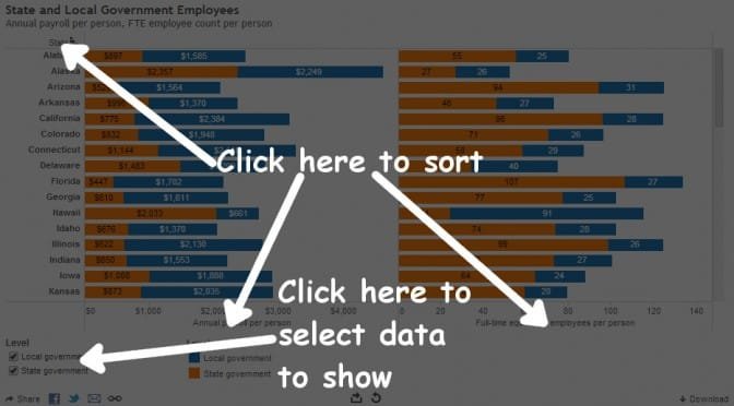
Using the visualization: Sorting and selecting.In the visualization you may chose which states to display. Also, by clicking on row titles you can sort the states by the values in that row. This lets you see which states collect a lot of tax, or do a lot of spending.
The states vary widely in levels of state government and local government employees, calculated on a per-person basis.
Two states have annual payroll costs per person of over $4,000, while many states operate on little more than half that. Only ten states have total government employee payroll costs greater than Kansas, on a per-person basis. (This does not include federal government employees working in Kansas.)
I gathered data from the U.S. Census Bureau for 2012, the most recent year available. Using Tableau Public, I created an interactive visualization. I show the full-time equivalent employees divided by the population for each state. Also, the annual payroll divided by population. (The Census Bureau supplies payroll data for only one month, the month of March, so I multiply by 12 to produce an approximation of annual payroll cost.)
Using the visualization: Sorting and selecting.There are two series of data, “Local government” and “State government.” The first series refers to the number of local government employees in each state, such as city and county employees. The second series refers to the number of state government employees in each state. Check boxes allow you to include either or both series in the chart.
By clicking on column headers or footers (“State,” “Annual payroll per person,” Full-time equivalent employees per person”) you can sort by these values.
Use the visualization below, or click here to open it in a new window, which may work best. Data is from United States Census Bureau, Government Employment & Payroll, data released March 2014.
There’s been dueling claims and controversy over employment figures in Kansas and our state’s performance relative to others. I present the actual data in interactive visualizations that you can use to make up your own mind.
(Let’s keep in mind that jobs are not necessarily the best measure of economic growth and prosperity. Russell Roberts relates an anecdote: “The story goes that Milton Friedman was once taken to see a massive government project somewhere in Asia. Thousands of workers using shovels were building a canal. Friedman was puzzled. Why weren’t there any excavators or any mechanized earth-moving equipment? A government official explained that using shovels created more jobs. Friedman’s response: ‘Then why not use spoons instead of shovels?’”)
It’s important to note there are two series of employment data provided by the U.S. Bureau of Labor Statistics, which is part of the U.S. Department of Labor. The two series don’t measure exactly the same thing. Nearby is an example of just how different the two series can appear.
A document from BLS titled Employment from the BLS household and payroll surveys: summary of recent trends explains in brief: “The Bureau of Labor Statistics (BLS) has two monthly surveys that measure employment levels and trends: the Current Population Survey (CPS), also known as the household survey, and the Current Employment Statistics (CES) survey, also known as the payroll or establishment survey. … These estimates differ because the surveys have distinct definitions of employment and distinct survey and estimation methods.”
State employment based on Current Employment Statistics (CES) survey, also known as the payroll or establishment survey.Another BLS document explains in detail the differences between the CPS and CES data. For example: CES: “Designed to measure employment, hours, and earnings with significant industrial and geographic detail” CPS: “Designed to measure employment and unemployment with significant demographic detail.”
State employment based on Current Population Survey (CPS), also known as the household survey.I’ve gathered data from BLS and made it available in two interactive visualizations. One presents CPS data; the other holds CES data. You can compare states, select a range of dates, and choose seasonally-adjusted or not seasonally-adjusted data. I’ve create a set that allows you to easily choose Kansas and our nearby states, since that seems to be relevant to some people. (I included Texas in this set, as we often compare ourselves to that state.) The visualizations are indexed, meaning that each shows the percentage change in values from the first data shown.
When two liberal newspapers in Kansas notice and report the lies told by a Democratic candidate for governor, we know there’s a problem. (Okay, the Kansas City Star is really a Missouri newspaper, but covers Kansas too.)
Peter Hancock wrote in the Lawrence Journal World: “Rep. Paul Davis, D-Lawrence, the presumptive Democratic nominee for governor, reportedly claimed again last week that school funding cuts under Gov. Sam Brownback’s administration have led to ‘thousands’ of teacher layoffs, a claim that has already been shown to be greatly exaggerated.” (Davis still exaggerating teacher layoff claims, March 12, 2013)
On the same day Steve Kraske of the Star reported: “Kansas Democratic gubernatorial candidate Paul Davis appears to be exaggerating the number of teacher layoffs under Gov. Sam Brownback. In an Overland Park forum last week, Davis said said that the governor’s budget cuts to education had resulted in thousands of teacher layoffs. But an annual personnel report from the state Education Department showed that a total of only 201 teachers were the victims of a ‘reduction in force’ in the 2011 and 2012 school years.” (Davis exaggerates teacher layoff figures)
None of this is news, at least to those who have been paying attention and are willing to dig into the Kansas State Department of Education for statistics. Well, the part about Paul Davis telling lies is news, as it is ongoing and contrary to the facts that Rep. Davis must surely know. (If he doesn’t know, what does that tell us?)
Last July I obtained, analyzed, and reported on Kansas school employment trends. I found that the situation is not the same in every school district. But considering the entire state, two trends emerge. For the past two years, the number of teachers employed in Kansas public schools has risen. Correspondingly, the pupil-teacher ratio has fallen.
The trend for certified employees is a year behind that of teachers, but for the last year, the number of certified employees has risen, and the ratio of these employees to pupils has fallen.
There’s also a video explaining these statistics. View it below, or click here to view in high definition at Youtube.
Davis and others complain that class sizes in Kansas schools are rising. I understand that the ratio of teachers to pupils is not the same statistic as class size. They measure different things. But if Kansas schools, considered as a whole, have rising teacher and certified employment levels that leads to decreasing pupil to teacher ratio, and at the same time class sizes are increasing — we have to wonder about the management of schools.
I’ve created interactive visualizations that let you examine the employment levels and ratios in Kansas school districts. Click here for the visualization of employment levels. Click here for the visualization of ratios (pupil-teacher and pupil-certified employee).
Primary U.S. energy production by fuel source, an interactive visualization. Source: U.S. Energy Information Administration, February 2014 Monthly Energy Review. Use the visualization below, or click here to open in a new window.
Stephen Moore. Credit: Willis Bretz/Heritage Foundation
The oil and gas boom in America boosts our competitiveness in the world economy while at the same time reducing carbon emissions, says economist Stephen Moore.
Moore recently left the Wall Street Journal to accept a position at Heritage Foundation as chief economist. He presented to an audience at a conference titled “The Tax & Regulatory Impact on Industry, Jobs & The Economy, and Consumers” produced by the Franklin Center for Government and Public Integrity.
A large portion of his presentation was on energy and its important role in the economy, and how radical environmentalists — the “green” movement — are harming our economy and people. An irony, he said, is that while President Barack Obama is in the “hip pocket” of radical environmentalists, he is presiding over the greatest oil and gas boom in American history. This boom is proceeding in spite of government, not because of it.
Moore emphasized the importance of energy costs to low-income people. Rising energy costs are like taxes on them, he said, while the wealthy can more easily absorb higher energy costs. “To be green is to be against capitalism, against progress, against poor people, against jobs.”
The boom in oil and gas production in America, made possible by horizontal drilling and fracking, is ahead of the rest of the world. While European countries have in the past embraced green energy technologies, these policies have failed, and the countries are retreating from them. Now, European countries want to use American drilling technologies, he said.
The lower electricity prices in America are a competitive advantage over Europe and China. German auto manufacturers are shutting plants in Europe and moving them to the United States, he said.
Of radical environmentalist groups. Moore said: “They don’t even care about global warming. If they really cared about global warming, they would be cheerleading fracking. Because fracking is making natural gas the new fuel for America. And guess what? Natural gas emits less carbon. It’s a great antidote to global warming.”
(According to the U.S. Energy information Administration, when generating electricity, coal emits from 2.08 to 2.18 pounds of carbon dioxide per kilowatt-hour electricity generated. Natural gas emits 1.22 pounds, or about 43 percent less carbon dioxide.)
Moore went on to tell the attendees that it is the United States that has reduced its carbon emissions the greatest amount in the last five years. He said this is remarkable in light of the fact that the U.S. didn’t sign the Kyoto Treaty, the U.S. didn’t implement cap-and-trade, and didn’t implement a carbon tax. “You would think these environmental groups would be applauding natural gas. Now these environmentalist groups have a new campaign called ‘beyond natural gas,’” he said.
Moore explained that at first, environmentalists said they could accept natural gas as a “bridge fuel” to solar power and wind. They were in favor of natural gas, he said, up until the time it became cheap and plentiful. Now, they are against gas. “My point is, the left and environmentalists are against any energy source that works.”
Over the past six years the U.S. has spent $100 billion promoting wind and solar power, but these two sources together account for just 2.2 percent of electricity generation. Even if the country were to quadruple the portion of electricity generated by these two renewable sources over the next 10 to 20 years, the nation would still need to get 90 percent of its electricity from other sources. Moore was doubtful that the country could quadruple the output from wind and solar.
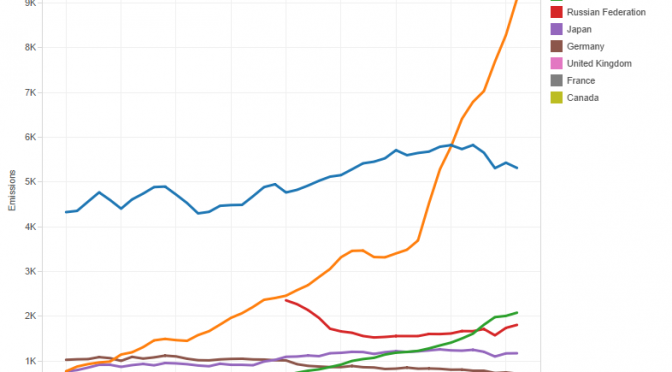
Trends in carbon emissions
To further investigate the topics Moore raised, I gathered data from Global Carbon Atlas and prepared interactive visualizations using Tableau Public. You may access and use the visualizations by clicking here. Following are static excerpts from the visualizations. Click on each image for a larger version.
Click image for larger version.
Looking at the amount of total carbon emissions, we see two important facts. First, after rising slowly, carbon emissions by the United States have declined in recent years. Second, carbon emissions by China are soaring. China surpassed the U.S. around 2005, and the gap between the two countries is increasing.
Click image for larger version.
Note also that carbon emissions in India are rising. Emissions in most advanced economies are steady or falling. These trends are emphasized in the chart that shows carbon emissions for each country indexed from a common starting point. Emissions from China and India are rapidly rising, while emissions from countries with advanced economies have risen slowly or have declined.
Click image for larger version.
A chart that shows the carbon emissions efficiency of countries, that is, the carbon emitted per unit of GDP, shows that in general, countries are becoming more efficient. Advanced economies such as the U.S., Japan, and Germany have an advantage in this metric. These countries emit about one-fourth as much carbon per unit GDP as does China.
Click image for larger version.
The chart of carbon emissions per person in each country show that the United States leads in this measure. In 2011, the U.S. emitted about 17 tons of carbon dioxide per person. China was at 6.6, and India at 1.7. But, the trend in the U.S. is downward, that is, less carbon emitted per person. In China and India, the trend is up, and rising rapidly in China.


 There’s been dueling claims and controversy over employment figures in Kansas and our state’s performance relative to others. I present the actual data in interactive visualizations that you can use to make up your own mind.